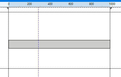
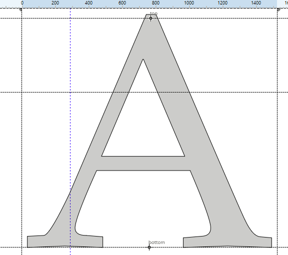
The horizontal guidelines (version 14) are identified but I can create vertical guidelines.
In some of the existing custom glyphs that I’m editing, the vertical guidelines are snapped to the left and right edges of the glyph, in others, the glyph is wider than the guidelines and in others, the glyph is much narrower than the space given by the vertical guidelines. In the main view of FontCreator, the vertical guidelines define the width of the white background.
Do these vertical guidelines define anything about the glyph such as space to the next character? Should the glyphs be centered on the 0 mark?