Namas te!
Dear BP, I’ve come to register here because I couldn’t resist your appeal! No, I’m not shy and I long to share my Font-Creator-creations with other people; but, excuse me, there may be some problems.
First of all, I’m a newbie. Last year, I purchased a cheap program that promised to turn my handwriting into a font, and was swiftly desillusioned. What I got didn’t resemble my handwriting in the least, and when I tried to make corrections, I discovered that the design tool of that program was terribly difficult to handle, whereas the curves were OT – dear me, will they ever get smooth? In short, the whole thing was a complete failure. Then I thought of other possiblities to use that program, e.g. to provide some of my favourite free fonts with those extra German characters that are lacking in most of them. Failure again! But by now I had become fascinated, and since I know a lot of Bastarda writings (that extremly decorative cursive hand of the “textura” eras), which for years I have dreamt of copying, I began to look around for a better program. I’m now working with FCP for three months. It’s wonderful throughout, but as to my gift for making fonts, I’m not so sure. Most certainly I shall never do it professionally. For all the pleasure I have in creating them, my fonts may not be worth looking at.
Secondly, I’m working at a lot of fonts alternatively – seven or eight these days, and none of them is near completion. If they are all finished, I shall select the best two or three to present them in the Gallery, no matter how harsh the criticisms; but I doubt that this event will take place so very soon – not before the end of the year, anyhow.
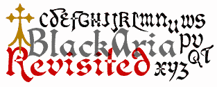
Thirdly, the only font I have completed so far, is not mine, originally. When I began to test FCP, I chose to alter a free font that I like very much, called BlackAria4. There are few opportunities to use it, since it has no upper case, no numbers, and no accented characters. Accordingly, I tried FCP to supply it with upper case and numbers, discovering in the process that this font had lots and lots of superfluous points and intersecting contours (I suppose the former is due to its being transformed from OT to TT ). Anyhow, I ended up with redesigning the whole font. Now, I should surely like to present it for download, the more so as I’ve made, for the sheer fun of it, a heap of accented characters that I shall never use. There may be a copyright problem, however: the curves are mine, but the glyphs are not. And I don’t know if this font was meant to be in the public domain. Therefore, I can so far only add an image to this gallery …

… supposing that I’m not the only one to be confronted with such problems, and hoping that some months hence I shall be able to contribute more.
Pia Frauss
![]()


