Wickednesse

Wickednesse.ttf (862 KB)
Okay, I’m back once again here with my first “serious” font, after quite a bit of revisions – I’d first posted it here back in March, but have made quite a few improvements to it since then (although many of those aren’t entirely “obvious,” of course).

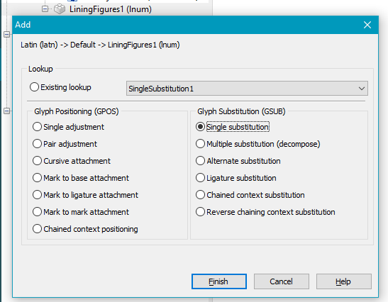
Notably, I added in those lining figures, as was discussed in the initial thread here back in the spring, and also added (or changed) a whole bunch of ligatures as well, along with a variety of other improvements. I like it a lot better, and with all my testing of it things seem to be working okay, kerning-wise, although I have a feeling that it probably wouldn’t hurt to do a lot more checking in that regard before coming up with an “official” release.

Before I start really getting more serious about kerning, however, just yesterday I did one rather major change to my font which I’m not entirely sure was a good – or bad – idea. I have so many ligatures, which basically got added in over time (as I discovered that new ones were needed or warranted), but in my PUA they weren’t in any particular order. If one’s software can make use of OpenType features then that’s not such a big deal, because they render out automatically, of course, but if you don’t have that (or choose not to use it) and instead try to find the ligature you want through Windows Character Map or MainType or whatever else, then trying to delve through that jumbled, disorganized mess of ligatures can be a real headache – especially for any ligatures that have an “f” or “ſ”(longs) in them, they really can look quite similar in my font. :open_mouth:

And so yesterday I re-did all those ligatures in my PUA and put them in a more sensible order, to make it more user-friendly in such contexts.

A couple questions about my having done that…

Firstly, are there any issues with my having done things that way? When I first did up those ligs in my PUA, I discovered that one could “complete composites” in there and it seemed that some of those slots were actually assigned to specific ligatures (which seemed a bit odd/surprising to me, since that seems antithetical to that being a “private use area”), but with my having reordered things obviously I’ve gone against those assignations.

Secondly, it’s a mystery to me how this happened, but when I look at my font in FC, in my PUA I have all those alternative fractions first, followed by all my various ligatures – but if I look at my font in MainType, my PUA starts with just three of those alt fractions, followed by all my ligs, and then come all the rest of my alt fractions.

That latter isn’t a huge deal, but I have no idea how that happened! Let alone why there’s a difference between what I see in FC and what I see in MainType.

In any case, here’s the latest – but not-quite-final – version of my font, along with some revised screenshots/samples. Any comments, about any of the above or anything else at all, are most welcome! :slight_smile:
Wickednesse 02 - Basic Latin.jpg
Wickednesse 03 - Punctuation.jpg
Wickednesse 04 - Latin Supplement.jpg
Wickednesse 05 - Ligatures.jpg
Wickednesse 06 - Greek & Coptic.jpg
Wickednesse 07 - Cyrillic.jpg
Wickednesse 09 - Symbols.jpg
Wickednesse 08 - Currency.jpg
Wickednesse 10 - Numbers.jpg
Wickednesse 11 - Any to Zanily.jpg
Wickednesse 12 - Pangrams.jpg
Wickednesse 13 - Lorem Ipsum.jpg
Wickednesse 14 - Wickednesse Quote.jpg

What the fudge – my uppercase “H” is up too high off the baseline. I thought I fixed that! Oh well. If anyone sees anything else funny going on like that (or anything else), please do let me know! :unamused:

Tell me about it. I am currently editing Guru (again), which has gone through numerous updates since 2008, but I am still finding ridiculous bugs.

A couple of suggestions:

Add a lining figures feature to make use of the glyphs that you have already designed. This lookup can be used:

lookup SingleSubstitution2 {
  sub zero -> uniE6A8;
  sub one -> uniE6A9;
  sub two -> uniE6AA;
  sub three -> uniE6AB;
  sub four -> uniE6AC;
  sub five -> uniE6AD;
  sub six -> uniE6AE;
  sub seven -> uniE6AF;
  sub eight -> uniE6B0;
  sub nine -> uniE6B1;
}

Kerning values for f still need some TLC. Use this Text in the preview toolbar to spot the problem pairs.

fafbfcfdfeffgfhfifjfkflfmfnfofpfqfrfsftfufvfwfxfyfzf

Is this for the alt (non-oldstyle) numerals I have? What’s a “lining figure” do?

And what do I do with that bit of code – copy/paste it into the code editor? Does it matter where, or just anywhere at all? I’ve never worked in the code there (not for fonts, anyway – I’ve worked in HTML/CSS code for decades now for the web and ebooks, but that’s totally different, of course).

Kerning values for f still need some TLC. Use this Text in the preview toolbar to spot the problem pairs.

fafbfcfdfeffgfhfifjfkflfmfnfofpfqfrfsftfufvfwfxfyfzf

>

Thanks! Exactly the kind of suggestion(s) I was hoping for -- at least if/when things don't look right, of course. I'm a bit "afraid" of kerning, though, I must admit. As my font is now, everything validates perfectly (including in the code editor), but it seems like any time I start doing any additional kerning, I end up with overlapping classes (even when I'm careful!) and that ruins everything. I think kerning just doesn't like me very much. :cry:

Also, looking at these various images again I see that several of my uppercase letters are too high off the baseline -- some almost unnoticeably, but nevertheless. I'm kicking myself for not seeing that before fixing that up and posting everything here.  :unamused:

Lining figures align with the top of capitals (approximately)

It matters a lot.

1. Add a Lining Figures Feature to the Default Language (Green [+] button)
Add Feature.png
Add a Single Substitution Lookup for Lining Figures (Green [+] button)
Add Lookup to Feature.png
Add substitutions manually to the lookup, or open the Code Editor from the icon at the top, and paste my lookup table code. The names of the lookup table must match or you will get an error.
Open Code Editor for Lookup.png

Don’t use the code editor, but use the Visual OpenType Designer. Search the pair adjustment lookup for pairs beginning with “f” simply by typing “f” then see which pairs need adjustment. Use the left/right cursor keys to adjust the kerning values manually. FontCreator gets it wrong in some cases.

Edit: The problems I spotted were mostly because you used ligatures instead of kerning pairs. As long as standard ligatures are supported and enabled, kerning pairs won’t be used.

Thanks, Bhikkhu (once again)! Do you, like, have all these screenshots handy already all the time when you post? Either way, your efforts are greatly appreciated! :slight_smile:

I’ll check all that out later – I’m desperately in need of a nap at the moment. :wink: Should I re-post my revised font as a new comment, or should I just edit my original post and swap out the new(er) font there once I’m done? I’m not sure what the usual practice is here in this forum.

I would edit the first post to remove and update the attachment, then post a new reply to bump the thread and tell us what you did.

Thanks! I’ll get back to you on that (updating the font). :slight_smile:

In the meantime, though, do you – or anyone else – perhaps know the answer to the question(s) I posed in my original post? Here’s what I’d written/asked about…

My Cankama font is a “Regular” style.

I have FastStone Capture installed. It loads on starting Windows, so it’s always ready to use.

Well, perhaps we’re both wrong – ha ha. :wink: Like I said, I assumed that mine would be “regular” because it’s the only weight for my font, but at the same time it does look rather “bold” (more so than your Cankama, although that’s a blackletter-style font, too). I’m taking it for granted that I (and you) are both right about our fonts being “regular,” but my other typophile friend’s assertion that it should be bold has me wondering.

I’m also clueless about that “weight” option there in the font properties – I don’t know what number to choose, let alone how that’s determined.

Do you know? The help files were of no, well, help. :unamused:

I have > FastStone Capture > installed. It loads on starting Windows, so it’s always ready to use.

I have that, too – great little screencapture program! It’s extremely kind of you to go to such efforts to help people out here, Bhikkhu (and for all these many, many years, no less). :slight_smile:

Oh, I only just noticed your edit from earlier…

Oh, that changes everything, if my kerning of my regular “f” glyph is okay (as I had thought it was). Indeed, it’s all those various f-ligatures and longs-ligatures that I had really wanted to kern, but which kept giving me overlapping classes when I did. I know what my mistake was now, that I was basically just adding in my lig plus whichever other single character next to it, when there was already a class for the latter, but it’s having to search through all those tons of classes in search of, say, an “a” (or whatever) that was a pain – although I guess ya gotta do what ya gotta do.

However, this is EXACTLY the reason why it would be nice if one could include those glyphs (selectively) from one’s PUA when you run autokern! Autokern could do within moments what would otherwise be a possibly hours-long, tedious chore. :frowning:

I really don’t understand why there’s no way to include glyphs from the PUA (selectively) when you autokern. Erwin, are you listening? :wink:

If you would like a pernickety comment, I would say that the cyrillic “л” and “д” look a bit modern. I don’t think the flat-topped versions appeared until the mid nineteenth century: until then I think they were still triangular.
However, if you have a Euro I can’t really complain about anachronisms (and this is your font, after all).

The important thing is that there are not enough blackletter fonts around. Keep up the good work!

Hey, Bern, thanks so much for your comments and kind words about my font! Yeah, you’re probably right about my Cyrillic, but I haven’t got the first clue about that – let alone Greek/Coptic (other than being familiar with some of the more “popular” characters, like pi and omega or whatever). I was just making those up as I went along, looking at – as you say – various different modern versions of each glyph and then trying to come up with something based on the style of the Latin characters.

However, with that said, I should say that I also did a little bit of research into this while working on those, looking at what Cyrillic writing looked like around the same time period (16th century) as the main font is in the book I scanned those from – and in many ways it was almost unrecognizable as the same alphabet! And so that’s why/how I ended up just saying to heck with it, and I’ll just make up something on my own, even if it’s not very “authentic.” :wink:

But I do appreciate your comments on that aspect, actually! If only because I have no clue at all about Cyrillic (etc.) writing, I was actually hoping for a little feedback on those. I can’t be bothered right now – my only real concern is getting the main Latin glyphs to look (and kern!), etc. okay – but who knows, perhaps some day down the road I’ll try to do a better job on those other character sets. :slight_smile:

I’m back! Got totally sidelined with other things in my life for months, but finally got back into the swing of things with my font, and just edited my original post with the latest version of it, along with revised screenshots – and also a couple questions in that edited post, too.

Look forward to hearing any comments (and/or criticisms) on it! Thanks so much, in advance, for anything anyone might have to say. :slight_smile:

No, that is fine. Complete Composites indeed works within the PUA, but this is not an official standard. You can read more about the reasoning here:
http://forum.high-logic.com:9080/t/complete-composites/1164/1

FontCreator can order glyphs by glyph index, code point, etc. MainType shows characters by code point, alternatively you can use the glyph mode to show all glyphs, sorted by glyph index.

FontCreator has a feature which allows you to reorder glyphs. It is available from the Tools menu. This will actually change the glyph index.

Thanks for your reply, Erwin! I’m just a little confused about this, though…

Do you mean under Tools → Sort Glyphs? I can’t see anything else under Tools that looks like anything like that – but that Sort thing only seems to change things similar to, say, a “View” menu might, or like in Windows Explorer one can sort things by filename, file size, date created or whatever. If that’s what you meant, it doesn’t seem to actually really change anything, like, in a permanent way (so that what I would see in FC is what I would then see in MainType or whatever)?

I guess it’s not too important, really, that those alt fractions got broken up like that (in MT) – the important thing is that all my ligs still came out in the order I wanted them, and all together in one block (apart from those few that do belong elsewhere, like the ones for ae, oe, fi, fl, etc.).

So I’ve posted my font twice here, first back in March, and then again (with revisions/improvements) yesterday. Each time I’d worked on it – off and on – for MONTHS, and then as soon as I do, within a day or two of sharing it, I see all kinds of things that are horribly (and all-too-obviously) wrong with it and that need fixing.

And I’m not even talking about that additional kerning that I wanted and expected to still do – I just mean stupid booboos that I should have caught in the first place, before that! Ugh! :unamused:

Tis the life of a font designer!

I like it, btw. I think ya did a good job on it from what I looked at. The alt r is kinda odd (if I am recalling the right character properly), which makes a quirky typeface all the more fun (for the most part).

Mike

Thanks, Mike, glad you like my font! Always nice to get positive feedback like that (although negative, constructive feedback is good, too). :wink:

Re my “alt r,” it’s actually not all that unusual at all – at least not for that style of font from that period. It’s quite commonplace, in fact, and actually has a name: “R Rotunda.” You can read up about it here (and elsewhere on the 'net, of course)…

https://en.wikipedia.org/wiki/R_rotunda

:slight_smile:

For anyone that’s following this thread, and what apparently is the on-going development of this font, there’s a couple of other threads here that directly relate to the direction I’m going with it (and problems/solutions).

Here’s one…

http://forum.high-logic.com:9080/t/designing-for-unfamiliar-character-sets/5870/1

…and here’s the other (this thread was started by a query from PJMiller)…

http://forum.high-logic.com:9080/t/cyrillic-blackletter-font/5760/1

Some really good stuff in there! Very thought-provoking for me, and hopefully informative, too, for others who might find themselves with similar questions in their type projects. :slight_smile: