There again, the text on which you based your font was printed on old paper, perhaps with worn type, so there is a lot of bleed. The original lead font would not have been designed to be distressed. Apart from minor defects in casting, that might result in slight differences between copies of the same letter, one assumes that the designers took great care to make their letter forms as smooth and clear as the manufacturing process allows.
To reproduce the distressed effect with a modern black letter typeface, one should print onto paper that allows some bleed of the ink, not deliberately distress the font design.
A Specimen Sheet by William Caslon, circa 1734, long before digital printing was invented.
Good points (and interesting ones, to boot) – that Caslon specimen sheet is pretty cool, too! And yes, I suppose you’re right that many of the imperfections that ended up in my font are in part due to the ink bleeding into the paper and stuff, although at the same time these metal types were hand-tooled, too, they were hardly done with microscopic accuracy, especially in those very early (or in this case relatively early) years of printing with moveable type.
Neverytheless, overall you’re right about that – but still, it’s the “look” of these old printed texts that I’ve been trying to emulate, how we perceive them “now” (if not back then, too). And in that regard, I didn’t create a font from scratch, out of nothing, and try to make it “look old,” but rather I used the original documents (or scans and photos of the pages, rather) and used those as the sources of my glyphs – thus what one is getting digitally with my font is fairly authentic, it comes from what one actually would see in real life.
Not counting my improvements by giving it all nicer kerning, and ligatures that work on-the-fly, and other stuff, of course – I guess in this project I’ve been trying to mesh the best of both worlds (old and new). Good points, though, as I said above.
Incidentally, after fixing up my “w” (and “v,” along with some other improvements like a little more kerning here and there), and thinking that I was finally happy with how it came out, once again I’m not sure!
I think I’ll just delete the “w” and “v” from my alphabet completely – that’ll solve the problem. Ha ha
Speaking of old type specimens, I’ve always been quite intrigued with the font created by William Caxton, Britain’s first printer – it’s really quite lovely, at least to me, although a bit less legible than later fonts, and it would probably be somewhat more difficult to get right (and naturally a big part of the problem would be finding examples of all the various characters, and at reasonably-high resolution). To the best of my knowledge, nobody has ever created a digital version of Caxton’s font, but I think it would be pretty cool – you could make quite a nice calligraphic-style font with it, in fact, especially if you add in piles of alternates and stuff, too.
I suppose you must be familiar with Caxton’s font, but if not there’s a nice example of it half-way down on this page (which you can click on to view a larger version of)…
What I find odd is all the variations between the same letter – it definitely doesn’t look like it was moveable type, but rather was hand-written instead. I haven’t looked into how Caxton did his fonts, where/how all those variations came about, if he did indeed have so many different versions of the same alphabetic characters. Even if you only created one version/one glyph for each letter, though, with no variations, really, it could still make a really quite beautiful font.
Maybe some day (for me)! Who knows what the future holds, now that I’m wrapping up my first project (and, in effect, first stage of my apprenticeship at this).
Fer cryin’ out loud… all of a sudden all my various ligatures in my blackletter that contained an r-rotunda looked totally off, and so I re-did those just now, too. Also kerned a few more other things, too, that I discovered. And, of course, just reloaded that font (and the charset PDF) up here again.
This is embarrassing! So sorry, folks. I feel as though I may have jumped the gun in sharing my font, that I should have given it more time – but it’s all so very strange, really, as my blackletter is the font that I’ve been working on the longest, and probably put the most effort into, and I’m genuinely stunned at this late stage to be suddenly discovering so many things that need fixing up. I can’t understand why I never noticed these various things before.
In any case, at least it’s getting better, and not worse! I am sorry, though, for posting “too soon” – I really thought I was finished (in essence) when I first did, though.
When I search for John Alde I found no meaningful results, but Wikipedia has an entry for John Allde who was Scottish, and so presumably not based in London. If you know more, perhaps you might like to expand the Wikipedia entry, which is a stub.
Actually, I have a whole pile of info about him, including a whole book about the printshop – the “Long Shop in the Pultrye” – where he ran his business, along with his predecessors and successors, and all the various publications they’d put out, plus some PDFs I came across of scanned old books with entire chapters about him. I’ve been planning on eventually writing up an article about him, although in many ways there’s nothing very “exciting” to tell, most of the info about him is largely about his various publications.
That’s backburnered for the moment, though, but indeed that’s something I’ve already been planning – not for Wikipedia, but for my own site, and for an ebook I’ve been working on of his first book, the one that inspired me toward this project (starting with the blackletter) in the first place, “The Wickednesse of Magical Sciences” (one of those old grimoires that came out during that time).
I’m way ahead o’ ya! Just haven’t gotten around to it yet – first things first (the fonts).
I went back to attack that stupid “w” again, and then in the process found yet more things that needed fixing – and not only that, but I discovered that I needed half a dozen or so more ligatures, to boot!
I just don’t understand this, why I never noticed these things before – at least, I didn’t understand it, but I’ve just been thinking that I initially put all my efforts into the blackletter font alone, and it was only later on that I then did the roman and italic fonts (and then after that the smallcaps and initials), and I think what happened was that I had basically just let the blackletter slide, got absorbed in the other fonts and never really “finished up” the blackletter.
My bad, of course – but at least I’m discovering these things now, and getting all those other weird booboos fixed up, too. This has been incredibly frustrating, though (not to mention embarrassing).
This is so frustrating, discovering all these “little things” after I thought I was done.
Um, another frustration that accompanies that latter frustration is that with all these little things I’m finding, each time I do, I have to re-upload the fonts to my website, and then also edit my first post here and swap out the attached font files.
I’m not sure what the rules are for this forum – is one expected to post the actual fonts HERE, or can I just provide the link to my website instead? It would certainly simplify things for me if I can just post the link to my site instead, rather than effectively having to forever and eternally update my post here as well, each time I make a revision (in days, months, years to come).
Is that alright if I do that, just edit my original post, delete all the fonts in there, and simply provide a link to my website instead?
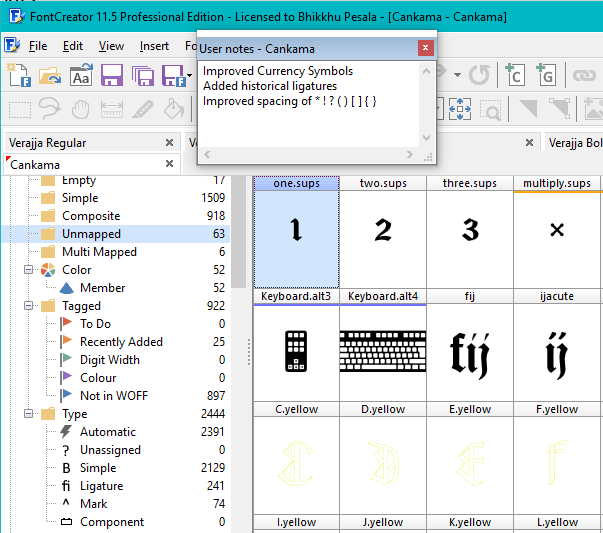
What is sometimes helpful, is to upload the FontCreator Project, then other FontCreator users can see your design notes, guidelines, OpenType tables etc., if you’re looking for help or critique on more than just the end result.
I’m not quite sure what you mean (or are referring to) – do you mean here in my post, or on my hard drive? I’m okay with how things are on the latter, although I did just rearrange things on my hard drive, but more for facilitating and simplifying getting the headers/titles better in those PDFs of my character sets that I’ve been putting together, more than any other reason. And I also re-saved all my FC project names to include a version number, too, which then shows up as the header in those PDFs.
That’s all neither here nor there as far as my previous query goes, though, of course.
What is sometimes helpful, is to upload the FontCreator Project, then other FontCreator users can see your design notes, guidelines, OpenType tables etc., if you’re looking for help or critique on more than just the end result.
I don’t use notes – and don’t know what “guidelines” are??? – and if I upload a TTF here, isn’t all that OTF info included in the font?
In any case, I don’t know if there’s anything in my project files that would really be helpful, any more than just the TTF fonts would be (although maybe there’s something I don’t know about these things).
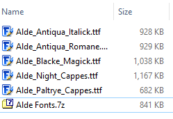
Thanks, though, to both you and Erwin for saying it’s okay to just edit my original post here and delete all the fonts and simply put a link to my site instead. Phew! It’s exasperating enough these past couple of days constantly re-uploading everything to there, each time I make a few corrections or improvements – especially for my blackletter font, I think I’ve uploaded about 10 or 20 different versions of “Version 1.00.”
If you archive five fonts, you only need to change one attachment instead of five. Space on your hard drive is seldom an issue, but I upload all of my fonts as archives to my web server to save upload/download time and server space. One archive may contain 16 font files and be one quarter of the size of the individual fonts.
To see the Notes Toolbar, press F2. Here, you can keep track of modifications that you have made and why. The Font Project file contains much more than just the TTF or OTF.
Oh, on your website, do you keep previous versions of your fonts available there, too? Is that what you meant? I was only going to just make available the latest version(s) – although on my hard drive I keep track of previous FC project files, of course. Disk space isn’t really an issue for me (plus I have a 12TB external RAID drive for backup).
To see the notes panel, press F2. Here, you can keep track of modifications that you have made and why. The Font Project file contains much more than just the TTF or OTF.
Oh, cool – I guess I just haven’t found a use/need for keeping notes or anything like that as yet, so I don’t think there’s anything “extra” that one would get by my uploading an FCP file here (rather than just the font).
Maybe some day, though! I’m still rather a newbie at all this, with these fonts really being the first “real” fonts that I ever produced, and I still have so much to learn about FC, too – heck, I didn’t even know about that comparison thing until the other day, for example.
No, I don’t keep previous versions of my fonts. If I am desperate to recover something, I will open a project file created in an earlier version of FontCreator.
The archives on my website contain *.otf, *.woff1, and *.woff2 versions of Regular, Italic, Bold, and Bold Italic, plus a set of *.otf for the web with fewer glyphs (that’s what the tag “Not in Woff” is for — quickly deleting all non-essential glyphs to export smaller versions for web use).
Oh, I’m confused then – what is it that you’re zipping up? Just all your old project files and stuff on your hard drive, is that what you meant? I don’t have that many font projects going (yet), but indeed, I can see that it certainly would save a lot of disk space if you do – I’ve been noticing that my fonts, when zipped up to upload to my site (for people to download), REALLY shrink in size.
Oh, do you mean for people to download via my website? I thought of that – maybe I’ll do that down the road, but for the time being I’m actually curious which of the fonts people might be particularly interested in. Like, even here I was surprised that only three of my five fonts (when I had them included in my original post – before I deleted them from there) were downloaded, none of you guys seemed interested in the other two.
I forget which ones they were now – I do know what you mean, though, but my curiosity to see which fonts are of interest (and which not) got the better of me.
Well, this is annoying. Do you guys have any idea why my ligs aren’t showing up in Internet Explorer? I remember having an off-forum discussion with you about this before, Erwin, and I thought I’d fixed that, but now it doesn’t seem to be working right.
Here’s the link again to my web page (just to make it easy, so you don’t have to dig for it)…
You should see it right off the bat, right in the title – that thorn+e should be coming out like my “Ye” ligature, but it doesn’t. The odd thing, though, is that that same thorn+e/Ye lig DOES come out okay in the preview form, down below there – but not in my headings (h1, h2, etc.).
My stylesheet is here…
I don’t know what I did wrong there – it works fine for me in both Firefox and Chrome.