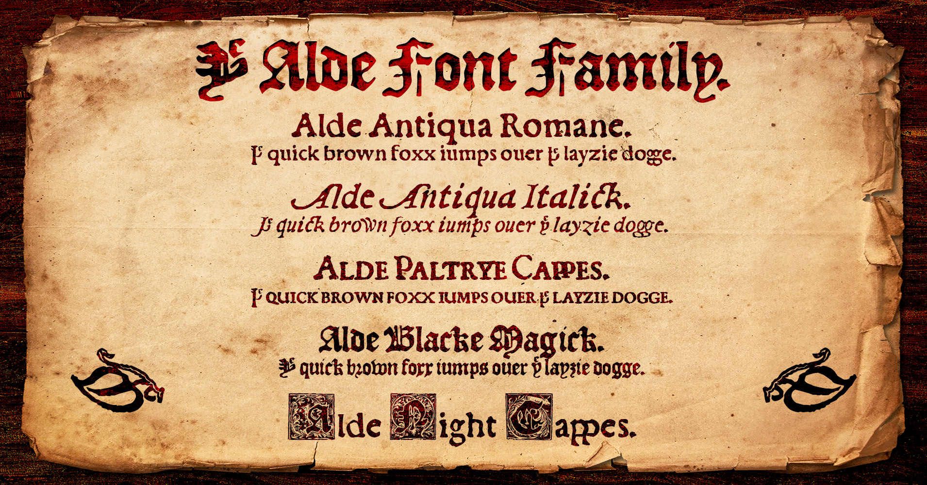
I present to thee… Ye Alde Font Familie!
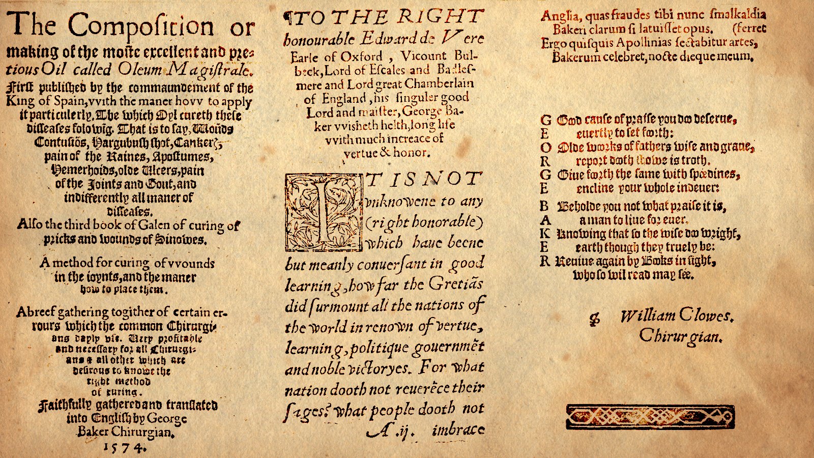
This set of fonts is based on the metal type created by the 16th-century London-based printer, John Alde. Below is a single, simple graphic showing the 5 fonts that are in this family, with their having been faithfully-reproduced in digital format from the original Renaissance-era sources, and now enhanced with the full extended character sets, Greek character sets, numerous ligatures and symbols, fractions and alternative fractions, and many other improvements which simply weren’t possible in days of yore, of course — a typographic project half a millennium in the making! ![]()
After debating with myself for years now whether or not to try to sell these, I’ve finally decided to give 'em away, and release them under the SIL Open Font License – although I would naturally love some feedback on them, if perchance anyone sees anything that I may have done wrong, or which could use a little improvement, before I do release them “officially” and start sharing them around the web and via social media.
You can download all 5 of my fonts here at this link…
…along with the character sets (in PDF format) as well. On that web page, you can see the WOFF files “in action,” too, embedded into the web page and used throughout (although I have as yet not embedded the font anywhere else on my site – totally revising my entire website in a variety of ways is another long-term project of mine)
And if you scroll down below the font info/download links, you’ll see that I also used an adaptation of the WOFF test from FontCreator in order for people to preview and play around with them or whatever (I’m deeply grateful to Erwin Denissen for kindly giving me permission to use that script, and for helping me “de-bug” it, etc. for use via my website, with various modifications on both my and his part). In fact, that’s probably the best way to preview my fonts, via that pseudo-WOFF test thingie there on the page (scroll down), far better than my posting a pile of sample images here or something. I’m quite sure that over time I’ll probably make some edits to the text (descriptions, etc.) that’s there, having only just put it all together recently, but I’d naturally be very curious if anyone has any feedback and/or suggestions for improvements that could be done there, too. ![]()
You’ll find quite a few little surprises in my fonts re the ligatures, I’m sure – for example, hit the question mark twice and you’ll get what was actually the original question mark in Alde’s 16th-century font, or hit the exclamation mark multiple times and see it jump up and down, or the question + exclamation marks for the unique interrobang, or even just hit your period a few times and watch the ball roll along. And for that “Ye” ligature, just type the thorn character (either upper- or lowercase, depending which you’re shooting for) and an “e,” and there you go!
All sorts of little goodies in there! Hope ye typophiliac heathens like 'em! ![]()