Tasmin - Scan, Copy, Paste, Polish, Validate!
Posted: Mon Sep 17, 2007 5:36 pm
 Dan X Solo[/url], born in 1928, is one of my Heroes. He became interested in printing as a teen when he bought some lead cast typefaces, and spent most of the rest of his life collecting new and exotic fonts. He ran a profitable printing business specializing in unusual typefaces for many years. The SoloType Catalog contains 4,147 Display Typefaces.
In 1976 Dan began publishing Royalty Free Font collections through Dover Publications. There are over 30 titles in his name, most of them containing 100 complete typefaces each.
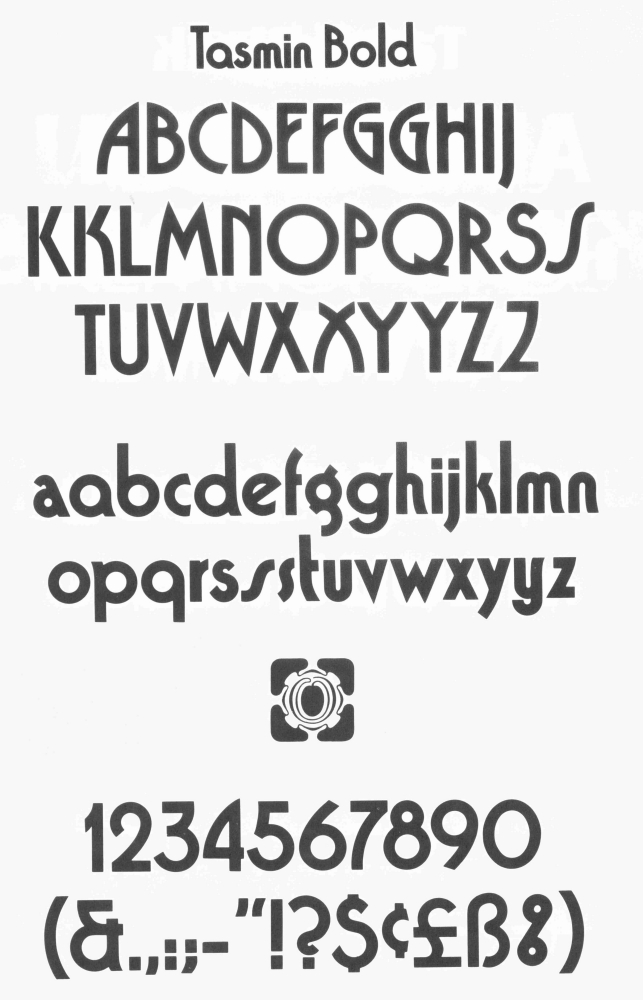
Tasmin is from his 1979 collection "Sans Serif Display Alphabets" page 96.
Now, what is the easiest way to convert these images into your Font Creator font?
1. Scan
I like to scan the whole 8 1/2 X 11 inch page so everything is sized the same, and the whole typeface is in one handy place.
Today I think 600dpi (dots per inch) in jpg format is the best choice. I can reduce down from that later on if desired.
2. Copy to ClipBoard
When I first started using Font Creator, I made jpg files for each individual character. What a waste of time and effort! Now I just use the masking tool in Corel Photo-Paint 8 to select the individual images directly from my master image and copy them to the clipboard, then paste them directly into the appropriate FC glyph editing window. The work moves along quite well. However, it IS useful to make ONE file for one character to set the proper multiplier in Import Image.
The Texas Dude uses "Snagit" to do the same job. Most image editors will work.
Before copying to the ClipBoard, as Erwin says, Size Matters! You have three paths available.
1. Go for it, and re-size later. This may induce distortions.
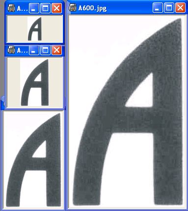
A scanned at 72dpi, 150dpi, 300dpi, 600dpi TS = 89, M = 4.22
2. Resize the whole image so each character pastes at the desired f-unit size. Interesting things can happen using this method.
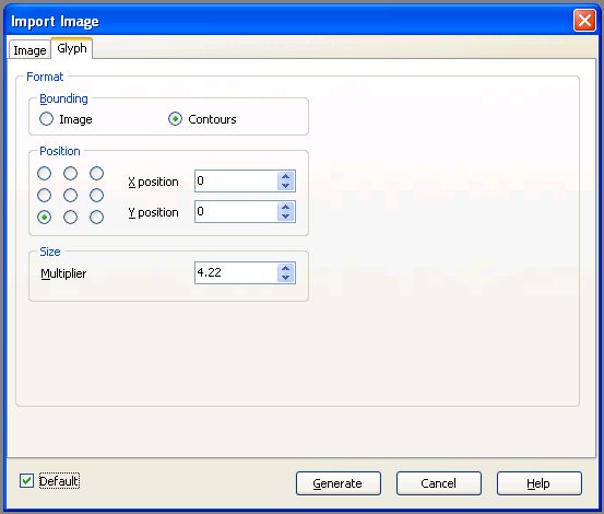
3. Change the Default Multiplier Setting in Import Image. Probably the best choice. There WILL be deviations in output, so some minor re-sizing will be necessary. Usually Contour mode works best to make minor over-all adjustments.
3. Paste
A pasted at 72dpi, 150dpi, 300dpi, 600dpi TS = 89, M = 4.22
With a little experimenting, I found that a Multiplier of 4.22 would paste the A from my original 600dpi scan at 1599 f-units high.
That is close enough to my desired 1600 f-units.
Reducing to 300dpi produced an image 798 f-units high
Reducing to 150dpi produced an image of 397 f-units
Reducing to 75dpi produced an image of 198 f-units
That is enough information to verify that doubling the Multiplier would work for maintaining the desired size for each reduction in dpi.
NOTE: Bhikkhu Pesala has recently pointed out that using Smooth Filter None will produce sharp corners.
Another important consideration is the Threshold Setting for Import Image.
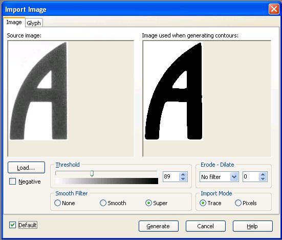
Where do you want the cut-off point accepted from those gray pixels?
0 = all black, 255 = all white. By sliding the scale, you can see the changes as more and more pixels are being accepted or rejected.
For the above images, a TS of 89 produced an A600dpi image with 44 points, A300dpi with 34 points, A150dpi with 25 points, and A75dpi with 18 points.
Experiment and find out what works best for your scanner and graphic program.
First Decision: How big do you want your Cap M? (EmSq)
As explained above, I like 1600 X 1600. You will have to decide whether this will include "White Space" or not.
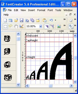
As the original Cap H on this page is only 5/8 inch tall, a direct paste around 1600 f-units tall required an Image Multiplier of 4.22
Click on the Import Image Button and make your preferred settings in the Image and Glyph windows, Check the Default box to keep your settings.
To move to the next glyph editing window press one of the blue arrows to advance or close the editing window and select another glyph from the main screen.
As Cap H and x-height values are set by placing these two glyphs (H, x) in a new FC font, they should be the first two glyphs pasted in. Make sure the tops of the glyphs are where you want them.
Time for another decision. Which G are you going to use? Which S?
Where will you put the alts, or will you just forget them?
I forgot them.
4. Polish
I prefered to paste all the characters into a new font, save it (lots of times in between) and then start the cleanup process.
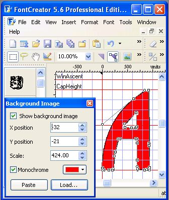
With this font, I noticed how easy it is to paste to the glyph editing window, then paste to the Background ToolBar (View > Toolbars > Background) while the image is still in the clipboard, polishing as I go. Overall, this method appears to work far better than my old one.
You will notice that a few new glyphs are straight up and down, but some lean left or right. This will probably happen no matter what you do.
Sometimes the characters are drawn slightly crooked, or printed or cut crooked in manufacture. It is hard to get the book square on the scanner. Whatever the cause, it happens. In some places the ink bled or was smeared. No big deal. Now is the time to straighten them up.
a. Stem Width. Look before you leap! What is the average stem width of the glyphs? They are probably not all the same. What width is most common. What width do you want?
Most of them looked to me to be about 300 f-units wide.
1600/300 = Ratio of 5.3 which falls in the Demi range.
This is supposed to be a Bold font with a rat # around 4.5
1600/4.5 = a f-unit width of 355.55555.
That is clumsy so I decided to use 350 on the Caps.
242 seemed to work out well for lower case.
If you don't like that, change it on your version.
b. Start with the straight characters like !, L, l, I, i, E.
You know where the dots need to be. Just move the corner dots to 0,0; 0,1600; 1600,350; and 0, 350 for most of them. Delete any unneeded points. This phase goes fast. No sweat!
Sometimes it is easier to just use the Eraser Tool and start over using the Rectangle Tool.
For T you will have to do a little calculating. I went with 700 f-units wide for the top. That places the center of the stem at 350, and the edges 175 on each side of that.
c. Finish with the Curves.
Remember, the higher the dpi (Dots Per Inch) setting you used to scan your image, the larger the resulting image will be,
... and the more pixel jags your FC pasted image will have.
The BAD NEWS of going with a lower dpi is that corners are no longer well defined, and curves go a little "wobbly."
If glyph edges are well defined, straightening up the corners is easy, but the curves?
I used 150 dpi and noticed the "kick-out" on the a, d, m, n, p etc. varied from glyph to glyph. Some extended 52 f-units from the stem, others to as much as 150 f-units.
"Consistency is the Hobgoblin of Small Minds."
I made them all 100.
As for the rest? Worra, worra, worra, WHAT TO DO?
If you started with poor images, You have two choices. Leave them as they are, or clean them up.
If you chose to clean them up, you have three choices.
1. Start moving points around and hope for the best.
2. use your original image as Back Ground (red) and start moving points around.
3. Use the Rectangle and/or Ellipse tool to step by step replace the contours.
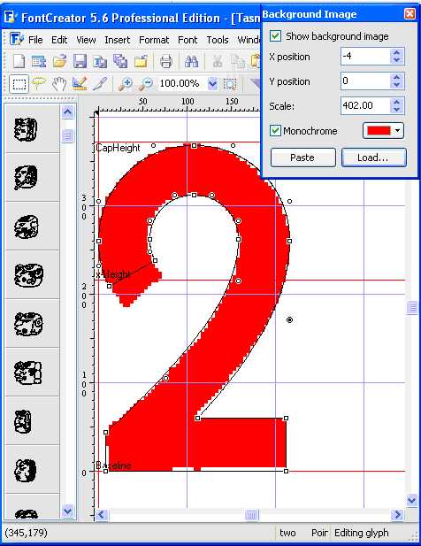
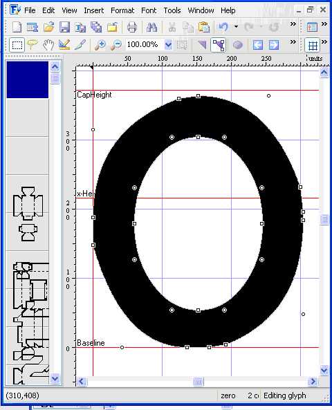
For most curves, 2. is often the best choice.
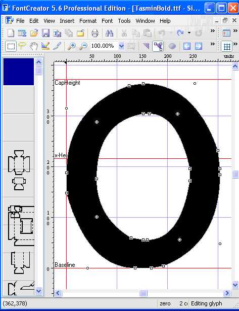
For circle and ellipse cleanup, I like 3.
Pitiful, huh?
Remember that the circle or ellipse fits in a box shape. Define at least one corner! Two diagonal corners are even better. Move an off-curve point to this location(s).
How? select a side point and look at the numbers at the center bottom of the screen (the left hand bottom numbers tell you where your curser is). the first number tells you how far the point is from the x-axis. Move the (possibly new) off-curve point to that distance. Now select a top of the curve point and look at the second number at the bottom. Move the corner point to that height, and you now have the corner properly located.
Select the Ellipse Tool, and set the cross-hair on any corner point, hold down the left mouse button as you drag the resulting circle/ellipse across the space. If you want a perfect circle, hold down the Shift key while forming the circle.
You may want to magnify the work area as much as possible for more accurate placement while you do this.
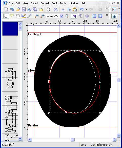
I find it easiest to do the inner contours first. Don't forget to reverse their directions!
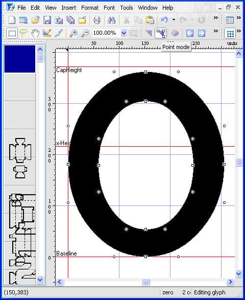
At this point you are well advised to change to contour mode and use the Q & W keys to step through the contours and delete the old inner contours.
Now for the outer contour. Use the Ellipse Tool to make both circles and make sure they fit fairly well over their respective parts of the glyph, and cross at the original meeting points.
"Tis done!
 Easier done than 'splained.
Validate! When you think you are done with a glyph, it is good practice to press the Glyph Validate (blue with a red !) button to verify you haven't made any errors. On finishing the font, select Font > Validate to check out the entire font.
Here is a new augmented, kerned, and otherwise updated and improved version of TasminRegular.ttf by Bhikkhu Pesala.
http://homepage.ntlworld.com/pesala/Fon ... egular.ttf