I am developing a font (for personal use only) and keyboard mapping to facilitate digital representation of metrical markings in latin poetry.
Basically, I wanted to take Times New Roman and convert it into a fixed width font so that I may anticipate the character lengths above which the metrical marks are going to be placed. I realize that there are plenty of fixed width fonts out there, I just don't like the way the characters look.
Here's what I've done:
Open Times.ttf
Save As... Roman Times.ttf (so I don't accidentally screw anything up)
Autometrics >>
Fixed:
Change Advance Width (900)
Exclude Empty Glyphs
Ok, before I even get into issues of centering...
The characters all look ok, albeit oddly spaced, at this point...
EXCEPT "r" & "t" @ sizes below 24. Above 24 they look fine.
the "ball" (I think that's the right term) or the "r" (the part that overhangs) becomes elongated. when I look at the glyph, however, it appears fine, just as the character does at a larger size.
same deal with "t," although it is the leg at the bottom that is getting elongated.
I am having the same issue when I exclude these characters from Autometrics and simply manually change the bearings to 900. Oddly enough, when I change change the bearings to, say 1500, I don't get this issue, but if I move them first to 900, then to 1500, the issue remains...
Probably related to this: when I use Autometrics, if I set the Advance Width to something like 2000, which I'm assuming is wider than any individual glyph, I don't get this problem.
Any advice you have to offer will be greatly appreciated, then maybe we'll move on to my centering issue.
Autometrics Glyph Distortion Issue...
-
Bhikkhu Pesala
- Top Typographer

- Posts: 9889
- Joined: Tue Oct 29, 2002 5:28 am
- Location: Seven Kings, London UK
- Contact:
Regarding the characters not looking good at small sizes, see the frequently asked questions.
If you manually modify the right side-bearing only, the hinting will not be lost (see the little H at the intersection of the rulers), but if you attempt to centre the glyph or use autometrics, this will move the glyph and that will remove the hinting. Hinting has no effect on printing, but does affect the on-screen appearance at small sizes.
If you attempt to edit a proportional font to make it monospaced you are not going to end up with a good-looking font, so don't waste the next month trying. Search again to find a monospace font that does look good — Prestige is one of the few I know of — or design one yourself specifically for your project.
Times New Roman is one of the most overused fonts there is — and is not easy to read on the screen. If that is your target, try something more like Bitstream Vera, which you can legally modify to suit your needs.
There is Bitsream Vera Mono, but like Vera Sans that is also Sans Serif.
If you could illustrate what you are trying to achieve with metrical markings, perhaps we could suggest an easier route to your goal. Diacritical marks can be automatically centred over glyphs of different widths, for example. If metrical markings are similar, perhaps you could just modify the accents?
Last edited by Bhikkhu Pesala on Mon Oct 01, 2007 6:26 am, edited 1 time in total.
-
undisputedebony
- Posts: 6
- Joined: Sun Sep 30, 2007 4:46 pm
Thanks For The Quick Response!
I've obtained a copy of the Prestige font. It looks to be perfect for what I'm trying to do.
Here's a crappily painted approximation of the desired result:

Basically, you're looking at what will be four lines of text...
one line of metrical characters per line of Latin.
From a FontCreator's perspective, here's what I believe I need to be able to produce:
For the Latin Lines:
1. Glyphs of all vowels with macrons (b/c Prestige doesn't have them)
2. A Glyph, basically a Breve moved down (as in between "pumice" & "expolitum")
3. (optional) Glyphs of all vowels with breves (b/c sometimes I'm feeling dorky beyond belief and would want to put them in too)
For the Metrical Lines:
1. A Macron Glyph which fills the entire advance width (b/c some of the macra need to appear as one extended macron across multiple letters).
2. A Macron Glyph which does not extend to the left side of the advance width (So that if there are two distinct macra in a row, they won't run together)
3. A Macron Glyph which does not extend to the right side of the advance width (for the same reason as 2, also to end a macron immediately preceding another)
4. A Breve Glyph which is one character wide.
5. A Left-Half of a Breve Glyph which extends from about 25% from the left side to the right side of the advance width (to begin a multi-character breve)
6. A Right-Half of a Breve Glyph which extends from about 25% from the right side to the left side of the advance space (to end a multi-character breve).
Note: the macron glyph which fills the entire advance width will serve as the middle of a multi-character breve.
I'm fairly sure I can do this, but I'm probably going to have some questions along the way...can I count on you guys/girls to walk me through the sticky parts?
If anyone wouldn't mind hearing me out, I'd like to take a second to think out loud. I'm leaning toward writing a .Net Application, essentially, a Latin Notepad, as opposed to writing a keyboard mapping. Because I can see how relying on deadkeys to type a 3 character breve would require the user to type [DeadKey + OpenBreveChar, DeadKey + FullMacronChar, DeadKey + CloveBreveChar]. Whereas in a .Net App i can allow her/him to type [(simulated)Macron DeadKey + 3] for a three character macron, &c.
Also, this Prestige font isn't public domain is it (i.e., I'm not allowed to mod it (or leave it alone for that matter), and then package it up with this application and distribute it to the Geeks in my department and beyond)?
I think that's all for now.
Sorry for all the questions!
You guys are great!
-William
Here's a crappily painted approximation of the desired result:
Basically, you're looking at what will be four lines of text...
one line of metrical characters per line of Latin.
From a FontCreator's perspective, here's what I believe I need to be able to produce:
For the Latin Lines:
1. Glyphs of all vowels with macrons (b/c Prestige doesn't have them)
2. A Glyph, basically a Breve moved down (as in between "pumice" & "expolitum")
3. (optional) Glyphs of all vowels with breves (b/c sometimes I'm feeling dorky beyond belief and would want to put them in too)
For the Metrical Lines:
1. A Macron Glyph which fills the entire advance width (b/c some of the macra need to appear as one extended macron across multiple letters).
2. A Macron Glyph which does not extend to the left side of the advance width (So that if there are two distinct macra in a row, they won't run together)
3. A Macron Glyph which does not extend to the right side of the advance width (for the same reason as 2, also to end a macron immediately preceding another)
4. A Breve Glyph which is one character wide.
5. A Left-Half of a Breve Glyph which extends from about 25% from the left side to the right side of the advance width (to begin a multi-character breve)
6. A Right-Half of a Breve Glyph which extends from about 25% from the right side to the left side of the advance space (to end a multi-character breve).
Note: the macron glyph which fills the entire advance width will serve as the middle of a multi-character breve.
I'm fairly sure I can do this, but I'm probably going to have some questions along the way...can I count on you guys/girls to walk me through the sticky parts?
If anyone wouldn't mind hearing me out, I'd like to take a second to think out loud. I'm leaning toward writing a .Net Application, essentially, a Latin Notepad, as opposed to writing a keyboard mapping. Because I can see how relying on deadkeys to type a 3 character breve would require the user to type [DeadKey + OpenBreveChar, DeadKey + FullMacronChar, DeadKey + CloveBreveChar]. Whereas in a .Net App i can allow her/him to type [(simulated)Macron DeadKey + 3] for a three character macron, &c.
Also, this Prestige font isn't public domain is it (i.e., I'm not allowed to mod it (or leave it alone for that matter), and then package it up with this application and distribute it to the Geeks in my department and beyond)?
I think that's all for now.
Sorry for all the questions!
You guys are great!
-William
-
Bhikkhu Pesala
- Top Typographer
- Posts: 9889
- Joined: Tue Oct 29, 2002 5:28 am
- Location: Seven Kings, London UK
- Contact:
Re: Thanks For The Quick Response!
It looks like it would create problems when editing the text, but maybe it makes designing the font easier than trying to do it all in one line (I think that would be better technically. There is nothing preventing you from increasing the line spacing to allow for the high metrical accents).undisputedebony wrote:Basically, you're looking at what will be four lines of text... one line of metrical characters per line of Latin.
Run the Transform script, "Eastern Europe." That wiill do most of the work for you, then just copy the smaller diacritical dot from the diaeresis to the dot below and mid-dot.1. Glyphs of all vowels with macrons (b/c Prestige doesn't have them)
3. (optional) Glyphs of all vowels with breves (b/c sometimes I'm feeling dorky beyond belief and would want to put them in too)
I would be tempted to redesign the underline glyph to suit this purpose as it is easy to type and not much used, but you could use undertie — decimal codepoint 8255.2. A Glyph, basically a Breve moved down (as in between "pumice" & "expolitum")
Making the font easy to use is crucial. You could perhaps use a font style switch to italics to type metrical diacritics.I'm leaning toward writing a .Net Application, essentially, a Latin Notepad, as opposed to writing a keyboard mapping.
It is hard to find public domain fonts. Bitstream Vera is released under GNU license (as are my own fonts), so you can modify them as long as you also rename them and retain the GNU agreement.Also, this Prestige font isn't public domain is it (i.e., I'm not allowed to mod it (or leave it alone for that matter), and then package it up with this application and distribute it to the Geeks in my department and beyond)?
At this stage you could use Prestige for your personal use to test the feasibility of the project. You will probably need to design your own font to get exactly what you want — and something that you can distribute as you wish — but ithat is not easy to do well.
-
undisputedebony
- Posts: 6
- Joined: Sun Sep 30, 2007 4:46 pm
re: re: re: re:
Thanks for the advice!
Here's what I've hammered out so far. Although it isn't too pretty, it's progress.

this is a .doc to .pdf conversion, so not on-screen appearance, but printed.
As you can see, how good it looks is entirely dependent upon size. some of the smaller sizes actually look better than the bottom sample, some look slightly worse.
With respect to one line vs. two:
I have downloaded Vera, and will look at it tomorrow. I think I'm going to keep this project personal for now, but there are a few people out there who would definitely put it to better use than I will. It's not much (if any) of a stretch make this compatible with the Greek alphabet either. Anyway, we'll see how I fare in the next 24 days until I get the plug pulled on my trial. If I am able to produce something safely under GNU and worthy of a donation request on my site, I will gladly purchase a copy of (at least) the Home Edition.
I'll probably be doing one re-working or so a day until I come up with something decent. At some point, I'd appreciate it if somebody would let me send them the .ttf, and tell me what kind of dreadful things I've done to it.
If a moderator would like to move this topic to a more appropriate forum at some point, by all means...go for it.
Thanks again everybody for the support!
Here's what I've hammered out so far. Although it isn't too pretty, it's progress.
this is a .doc to .pdf conversion, so not on-screen appearance, but printed.
As you can see, how good it looks is entirely dependent upon size. some of the smaller sizes actually look better than the bottom sample, some look slightly worse.
With respect to one line vs. two:
Maybe I'm thinking inside of the box, but I don't see how this approach feasible. The problem is, the long and short syllables have variable numbers of characters, so an individual metrical accent may have to span anywhere from 1 to 5 characters, even more if there's an ellision (the thing which, on the Latin line is represented by the curved, underscore-looking thing). So think of the metrical markers as standing over whole syllables, rather than characters. If there is a way to do what you're suggesting, I'm all for sound technical practice.Bhikkhu Pesala wrote:It looks like it would create problems when editing the text, but maybe it makes designing the font easier than trying to do it all in one line (I think that would be better technically. There is nothing preventing you from increasing the line spacing to allow for the high metrical accents).
I have downloaded Vera, and will look at it tomorrow. I think I'm going to keep this project personal for now, but there are a few people out there who would definitely put it to better use than I will. It's not much (if any) of a stretch make this compatible with the Greek alphabet either. Anyway, we'll see how I fare in the next 24 days until I get the plug pulled on my trial. If I am able to produce something safely under GNU and worthy of a donation request on my site, I will gladly purchase a copy of (at least) the Home Edition.
I'll probably be doing one re-working or so a day until I come up with something decent. At some point, I'd appreciate it if somebody would let me send them the .ttf, and tell me what kind of dreadful things I've done to it.
If a moderator would like to move this topic to a more appropriate forum at some point, by all means...go for it.
Thanks again everybody for the support!
-
Bhikkhu Pesala
- Top Typographer
- Posts: 9889
- Joined: Tue Oct 29, 2002 5:28 am
- Location: Seven Kings, London UK
- Contact:
Re: re: re: re: re:
Here, I have used combining double diacritical marks (861-863). They have zero advance width, and can be as long as you need. They are usually typed after the letter with which they combine.undisputedebony wrote:I don't see how this approach feasible.
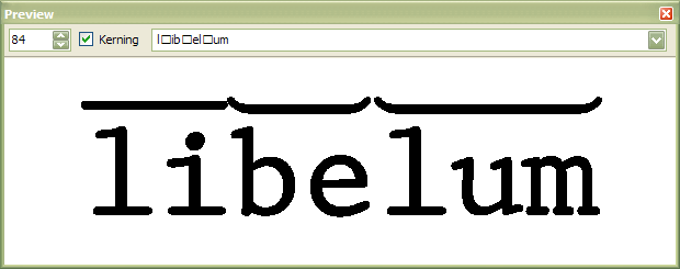
What I would do is create different metrical marks for every case rather than making the user compose them from start, middle, and end. It will also allow for better design of the breve.
Type the l, type the combining macron, type the i, type the b, type the combining breve, type the e, type the l, type the long combining breve, type the u and the m, etc.
I didn't need to do anything to the vertical font metrics, I just moved the combining accents right up to touch the WinAscent line. If you need more space then move the marks above WinAscent, and Format, Settings, Metrics, Maximum, Recalculate.
For typing I would use the Microsoft Keyboard Layout Creator to create a custom keyboard. I would assign one dead key to macron and one to breve. Type dead key followed by 1,2,3,4,5 to get metrical marks of different length.
Last edited by Bhikkhu Pesala on Mon Dec 03, 2007 10:35 am, edited 3 times in total.
-
undisputedebony
- Posts: 6
- Joined: Sun Sep 30, 2007 4:46 pm
Wow!
Cool! I was sincerely under the impression that that was impossible. I'm sure this is going to take me some time to figure out, but that is fantastic! They don't call you a "Top Typographer" for nothing, right?
Thank You, Thank You, Thank You!
Thank You, Thank You, Thank You!
-
Bhikkhu Pesala
- Top Typographer
- Posts: 9889
- Joined: Tue Oct 29, 2002 5:28 am
- Location: Seven Kings, London UK
- Contact:
I could send you the font, but I don't wish to spoil the joy of discovery for you. 
Here is the combining triple breve, with the l, u and m shown from the Comparison Toolbar (F11).
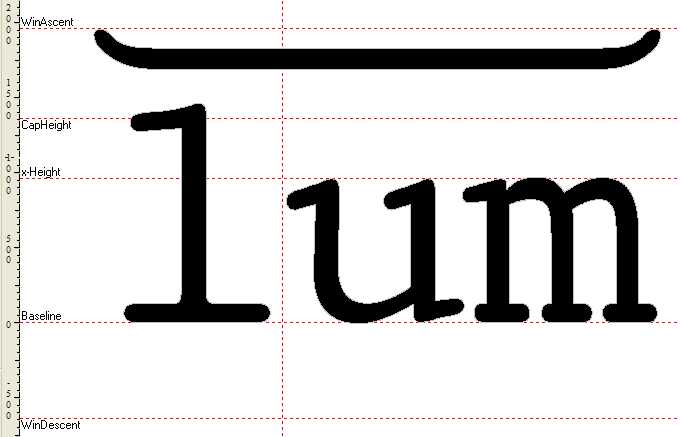
Here is the combining triple breve, with the l, u and m shown from the Comparison Toolbar (F11).
Last edited by Bhikkhu Pesala on Mon Dec 03, 2007 10:35 am, edited 2 times in total.
-
undisputedebony
- Posts: 6
- Joined: Sun Sep 30, 2007 4:46 pm
-
William
- Top Typographer
- Posts: 2038
- Joined: Tue Sep 14, 2004 6:41 pm
- Location: Worcestershire, England
- Contact:
Regarding whether to use a monospaced font or a non-monospaced font, it occurs to me that there is another possibility.
Suppose that a font were made where a glyph is either of one width or is of another width. Perhaps the second width could be 1.5 times the first width. Then the first width could be used for most lowercase together with capital I and the second width could be used for m, w and most capitals. The two widths only approach would not be ideal as letters like M, W and i, j and lowercase l would still present a challenge. However, for whatever reason, whether just my personal taste or some well-known effect of viewing lettering, with monospaced fonts it is not the i being forced to be wider than it should ideally be that bothers me, it is the way that an m is squashed into a width narrower than it should be that looks wrong and gives a peculiar look to the text.
If such a face were produced with reference to the texts printed in latin by Nicolas Jenson in Venice in the 1470s, then maybe a rather nice serifed font could be produced with the angled line on the e, the longer serif on the rightside of the r and so on yet having just two glyph widths.
http://en.wikipedia.org/wiki/Nicolas_Jenson
This would mean that the glyphs for the metrical lines would each need two varieties to account for the two widths, yet that would not seem to present any fontmaking issues, though the resulting font would need more skill and care to use: however, the extra effort might well result in a much better look.
The various glyphs for the metrical lines could be mapped into the Unicode Private Use Area so there would be no problem in accessing them from many software packages which use Unicode.
William Overington
1 October 2007
-
undisputedebony
- Posts: 6
- Joined: Sun Sep 30, 2007 4:46 pm
re: fixed v. variable
Interesting you mention that, William. When I first gave this a serious go earlier tonight, I had not yet realized how implausible variable to fixed-width font conversion is. I discovered pretty quickly that that the m's and w's weren't going to fit into the same space as all my other characters, so I doubled their space (as well as a few capitals) and figured I would just have to double my macron to cover any of the wider characters. I've learned a lot since then, and had kind of disregarded that notion, but one could produce a very appealing document if it were done correctly.
I will think about this for down the road, and I presently thank you for an excellent suggestion. Unfortunately, it's 5:20 in the morning where I am located, and I still haven't prepared much of my Latin and Greek for tomorrow. Ironically, all I feel like doing is working on this Latin font...
(...funny how easy it is to do with a pen and paper!)
-
Bhikkhu Pesala
- Top Typographer
- Posts: 9889
- Joined: Tue Oct 29, 2002 5:28 am
- Location: Seven Kings, London UK
- Contact:
Re: re: fixed v. variable
Yes. Things don't always get easier as technology progresses.undisputedebony wrote:(...funny how easy it is to do with a pen and paper!)
Another trick you could use to replace the macron metrical marks is underlining. Just set the underline position on the Format, Settings, Post tab to the same as WinAscent (the underline position is usually a negative value, but it doesn't have to be). Applying the underline attribute will then overline any text, whatever width the glyph is.
-
William
- Top Typographer
- Posts: 2038
- Joined: Tue Sep 14, 2004 6:41 pm
- Location: Worcestershire, England
- Contact:
My first post in this thread referred to the following web page.
http://en.wikipedia.org/wiki/Nicolas_Jenson
Clicking on the illustration of some printed Latin text leads to a page specifically about that image.
http://en.wikipedia.org/wiki/Image:Jens ... ertius.png
There is a link to download a full resolution version of 2264 × 1209 pixels.
I have tried importing that image, all of it at once, into FontCreator and it looks good.
There are lots of letters and a number of ligatures in the image.
I noticed particularly that the i characters have the dot to the right of the vertical.
There also appear to be a number of accented vowels, of which I do not at present understand the significance.
I have noticed a number of occurrences of long s followed by i in the Latin text. I am wondering whether, for each of them, a ligature has been used or two pieces of type.
For the avoidance of doubt, whereas the image might well be used to make a partial font using FontCreator and that font might well be nice to have and use, I am not suggesting that such a font would be useful for setting Latin in the format posed in this thread. However, if a special font for the purpose is being constructed, maybe the image might provide some design ideas for the various letters of the font.
Here is a link to a thread which might be of interest.
viewtopic.php?t=1664
William Overington
1 October 2007