Autometrics Glyph Distortion Issue...
Posted: Sun Sep 30, 2007 5:32 pm
I am developing a font (for personal use only) and keyboard mapping to facilitate digital representation of metrical markings in latin poetry.
Basically, I wanted to take Times New Roman and convert it into a fixed width font so that I may anticipate the character lengths above which the metrical marks are going to be placed. I realize that there are plenty of fixed width fonts out there, I just don't like the way the characters look.
Here's what I've done:
Open Times.ttf
Save As... Roman Times.ttf (so I don't accidentally screw anything up)
Autometrics >>
Fixed:
Change Advance Width (900)
Exclude Empty Glyphs
Ok, before I even get into issues of centering...
The characters all look ok, albeit oddly spaced, at this point...
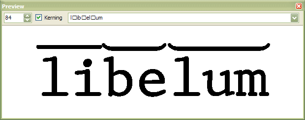
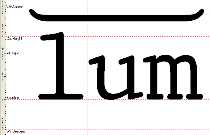
EXCEPT "r" & "t" @ sizes below 24. Above 24 they look fine.
the "ball" (I think that's the right term) or the "r" (the part that overhangs) becomes elongated. when I look at the glyph, however, it appears fine, just as the character does at a larger size.
same deal with "t," although it is the leg at the bottom that is getting elongated.
I am having the same issue when I exclude these characters from Autometrics and simply manually change the bearings to 900. Oddly enough, when I change change the bearings to, say 1500, I don't get this issue, but if I move them first to 900, then to 1500, the issue remains...
Probably related to this: when I use Autometrics, if I set the Advance Width to something like 2000, which I'm assuming is wider than any individual glyph, I don't get this problem.
Any advice you have to offer will be greatly appreciated, then maybe we'll move on to my centering issue.
Basically, I wanted to take Times New Roman and convert it into a fixed width font so that I may anticipate the character lengths above which the metrical marks are going to be placed. I realize that there are plenty of fixed width fonts out there, I just don't like the way the characters look.
Here's what I've done:
Open Times.ttf
Save As... Roman Times.ttf (so I don't accidentally screw anything up)
Autometrics >>
Fixed:
Change Advance Width (900)
Exclude Empty Glyphs
Ok, before I even get into issues of centering...
The characters all look ok, albeit oddly spaced, at this point...
EXCEPT "r" & "t" @ sizes below 24. Above 24 they look fine.
the "ball" (I think that's the right term) or the "r" (the part that overhangs) becomes elongated. when I look at the glyph, however, it appears fine, just as the character does at a larger size.
same deal with "t," although it is the leg at the bottom that is getting elongated.
I am having the same issue when I exclude these characters from Autometrics and simply manually change the bearings to 900. Oddly enough, when I change change the bearings to, say 1500, I don't get this issue, but if I move them first to 900, then to 1500, the issue remains...
Probably related to this: when I use Autometrics, if I set the Advance Width to something like 2000, which I'm assuming is wider than any individual glyph, I don't get this problem.
Any advice you have to offer will be greatly appreciated, then maybe we'll move on to my centering issue.

