I did not see a PDF, so I still don’t understand this issue. Again, if there is a problem, I need to understand it before I know how to fix it.
After using the FCP project file to generate the font, there was confusion in the naming of the font
You’re right, it works fine. It seems that Windows doesn’t support .otf correctly, or because I’m using the free Windows 10 Home edition.
I apologize for bothering you and wasting your time. To understand why, I’ve been working in the printing and publishing industry since 2000. I have an archive of approximately 3,000 designs, some of which are for books and school curricula, up to 200 pages long.
I used professional fonts specialized in printing and publishing in Unicode format, but these fonts are no longer supported in design and publishing programs.
So, instead of changing the fonts and reformatting all these designs, I decided to purchase FontCreator and update the fonts.
From the beginning of my work with FontCreator, I used .ttf until I read in a Google search that .otf fonts are more modern and offer advanced typographic features.

So I converted all my work from .TTF to .otf.
Now I’ve noticed this problem. Another issue I’ve noticed is that with large fonts, FontCreator is slower when previewing with .otf, but it works normally with .TTF.
Once again, sorry for the inconvenience. If you have any advice, please feel free to share it. Thank you very much.
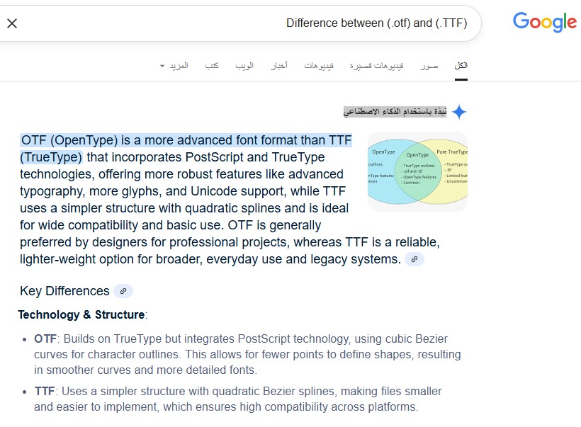
Thanks for the detailed message. A lot of web articles mix things up, including the one you quoted, so let me clarify a few points.
1) Extensions vs. what’s inside
-
.ttf and .otf are just file extensions for OpenType fonts.
-
Inside an OpenType font, outlines can be:
- TrueType (“glyf”) → quadratic curves
- PostScript (CFF/CFF2) → cubic curves
-
While it’s common to put quadratic outlines in a .ttf and cubic outlines in an .otf, it’s not a hard rule. An .otf can legally contain quadratic outlines. The extension is a convention, not a capability limit.
2) What the quoted article gets wrong
- “OTF is more advanced / has more glyphs / has Unicode support” → Incorrect.
Both .ttf and .otf are OpenType. Both fully support Unicode and can hold as many glyphs as the spec allows. - “OTF integrates PostScript and TrueType tech” → Misleading.
OpenType is the umbrella format. Fonts can use either TrueType (quadratic) or PostScript (cubic) outlines. Feature support (ligatures, alternates, etc.) lives in OpenType layout tables and works in both. - “OTF is preferred by designers for pro work; TTF is for basic use” → Subjective and not generally true.
Many professional families ship as TTF (quadratic) for performance/compatibility reasons; others ship as OTF/CFF for their own workflow reasons. It’s a choice, not a hierarchy. - “TTF is smaller” → Not inherently.
Size depends on outlines, hinting, tables, and compression (e.g., WOFF2), not the extension alone.
3) About Windows support and performance
- Windows 10 Home fully supports OpenType fonts in both flavors. Your issue is not about Home vs Pro.
- Preview speed: quadratic (TTF) can be a bit faster to rasterize on Windows; very large or complex cubic (CFF) fonts may preview slower. That matches what you observed and is normal.
4) Practical guidance for your workflow
-
You don’t need to convert working TTFs to OTF just to be “modern.” Both are modern OpenType.
-
If your goal is better behavior in apps, focus on clean OpenType layout features and correct font metadata rather than changing the outline flavor.
-
When exporting from FontCreator, pick the format that suits your workflow:
- OpenType (TTF / quadratic) for speed and broad comfort on Windows.
- OpenType (CFF / cubic) if you specifically want PostScript outlines (e.g., to match an existing family).
Use the extension that matches the outlines you export for clarity: .ttf for TrueType (glyf) and .otf for PostScript (CFF).
Here is an article we wrote some time ago which better explains it:
The Difference between TrueType and OpenType Fonts
Thank you very much my friend
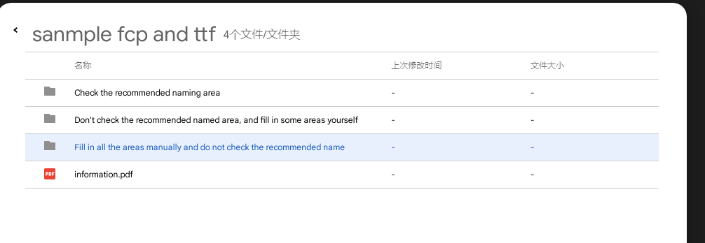
I gave the pdf and all the files in Google Cloud Disk,Please check it,If you can’t receive it,I will try to give other file network disk links。
In the package, I give the fcp files and the corresponding export TTF file in all three cases, as well as a PDF file with a brief record.https://drive.google.com/file/d/10_4RMqAo8B_WYTM1hpTHjZgdMgu9pFBe/view?usp=sharing
sanmple fcp and ttf.7z (1.1 MB)
I found that you can upload files directly here, so I uploaded the 7z zip package directly
I’m from China, and my English is not very good, so I can only provide a brief summary.
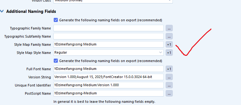
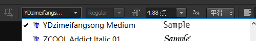
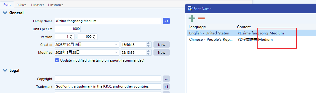
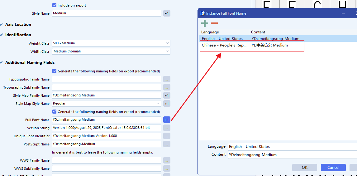
My goal is to create a font named “YDzimeifangsong Medium”, with its Chinese name being “YD字美仿宋 Medium”. Under normal circumstances, in the Chinese version of Photoshop, it should display “YD字美仿宋” with a weight dropdown next to it showing “Medium”.
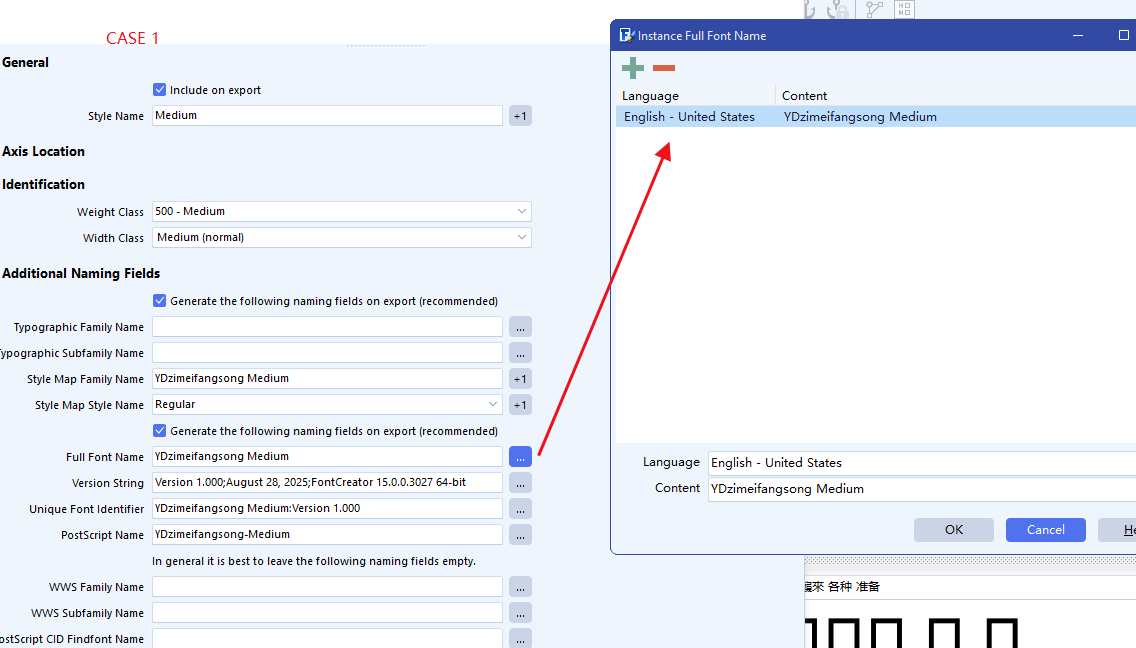
Case 1:
I cleared all the naming fields and used the software’s recommended naming.
After exporting, I found that in the Style Map Style Name, the Chinese name showed Medium instead of the correct Regular.
Normally, the Style Map Name should display “YD字美仿宋 Medium”, but it showed only “YD字美仿宋”, and the Style Map Style Name should be Regular, but it showed Medium.
Case 2:
I unchecked the recommended naming option. I manually filled in the font name, and in the Style Map Family Name and Style Map Style Name, I fully entered both Chinese and English names. In Full Font Name, I wrote the complete English name.
All steps are documented with screenshots in the PDF.
After exporting, I found that both the Style Map Family Name and Style Map Style Name became empty.
In theory, only when the weight is Regular should these two fields be defaulted as empty.
After installation, in Photoshop, the font displayed the full English name “YDzimeifangsong Medium”, behaving as an English font, and the weight could not be selected (see screenshots).
Case 3:
I completely filled in the following fields:
Typographic Family Name, Typographic Subfamily Name, Style Map Family Name, Style Map Style Name, and Font Full Name, all including both Chinese and English names.
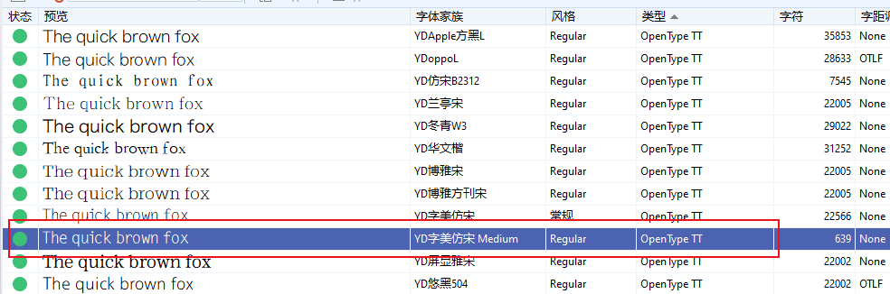
The exported font was usable (please refer to the screenshots in the PDF).
Personally, I suspect this might be an issue with how the software handles default weights like Regular, Bold, Medium, and Black.
Due to the time zone difference and my limited English, thank you for your understanding.
I have finally been able to understand the problem thanks to your detailed PDF document and the accompanied font files.
I have made some improvements to the naming part of the exporter, so do try this unofficial update:
https://www.high-logic.com/tmp/fontcreator/FontCreatorSetup15.0.0.3027-x64.exe
Let me know if this works for all 3 options you discussed.
in case1(cleared all the naming fields and used the software’s recommended naming), it works well.Although the full font name is only in English, it does not affect the use of fonts.

i have test case2 again。the problem still remains.
in maintype
The weighted name appeared in the family name.
And the Style Map Family Name , Style Map Style Name still be empty

Note for those who read my problem for the benefit, after I removed the Latin, the font names appeared correctly.
We will add the additional Full Font Name with the next update.
Somehow case2 and case3 should be the same, but I see if you open the exported font from case1 or case3 you get the situation of case2.
I need to think about this, as it is indeed confusing…
That is good to know!
Some more improvements, hopefully it is now all covered.
https://www.high-logic.com/tmp/fontcreator/FontCreatorSetup15.0.0.3028-x64.exe
Let me know your results.
thank you for your working.
i tested it again.
in case1(cleared all the naming fields and used the software’s recommended naming).
it works well,and it have added the chinese name in the full font name.
Perfect!
in case 2( I unchecked the recommended naming option. I manually filled in the font name, and in the Style Map Family Name and Style Map Style Name , I fully entered both Chinese and English names. In Full Font Name , I wrote the complete English name.)

it works ,the name has been correct.
Similar to the previous case 1 situation,the full font name not have the chinese name.
But I think this is correct.Because I didn’t check the recommended option, the system didn’t name it for me. At the same time, I didn’t fill in my Chinese name in the full font name.
i think the bug has been resolved.
Thank you for your persistence and for confirming the results. Great to hear the issue is resolved!
We really appreciate your support and careful testing.
Thank you for your help and hard work. Since we’re already in conversation, I’d like to share some personal thoughts with you — these are not official software recommendations, just my individual opinions.
I’m from China, where our language includes a vast number of characters. In common national standards, over 6,300 characters are needed to meet the requirements for a standard font. This makes font creation an extremely challenging task.
Windows is the dominant platform in daily computer use. Glyphs only supports macOS, FontForge is not very user-friendly, and although I previously used FontLab, it required enormous hardware resources to export fonts. In fact, I couldn’t export a complex calligraphy-style font on a machine with 16 GB of RAM. Ultimately, I chose FontCreator.
I truly appreciate your work. FontCreator has come a long way — from early versions where it was difficult to adjust font metrics like top margins or support vertical writing, to the excellent product it is today.
Here are a few suggestions I’d like to offer:
- Batch Import Functionality
I hope FontCreator can support a batch import feature. For example, using an Excel spreadsheet that maps character code points to image file paths. This would allow us to set up a table once and reuse it multiple times for automatic importing, instead of importing characters one by one. Alternatively, image files named using Unicode values could be automatically recognized and imported into the corresponding character slots. - Python Scripting Support
It would be great to support Python scripting, allowing direct manipulation of font parameters through code — such as adjusting the height of specific glyphs. In vertical writing for Chinese and Japanese, punctuation marks often need to be smaller to achieve a more aesthetically pleasing layout. A scripting interface or some kind of advanced configuration would help us fine-tune punctuation size and positioning more efficiently. - Simultaneous Glyph Editing and OpenType Design
When working with OpenType features, it would be helpful if we could view and edit glyphs while writing the OpenType code — allowing us to search for characters and build substitution logic at the same time. - Merging Characters from Different Fonts
Because designing all characters for Chinese fonts is such a huge task, sometimes the Latin glyphs are not included. It would be extremely helpful to have a feature that allows users to import or replace selected characters in one font with those from another — for example, replacing missing Latin characters in Font B with those from Font A. This would greatly simplify the font merging process.