Colour font previews

Here is a graphic that I produced from a Print Screen image by using just a part of the image.

The computer system is Windows xp. The software is FontCreator version 7.5.0 (build 508). The computer is running with a screen resolution of 800 pixels by 600 pixels.
Galileo_Lettering_Colour.png
Clicking on the image should display it in full.

Please note that I have added two colours to the palette, namely blue and light green. They are shown as the two palette colours at the right of the lowest line of palette colours. Those are the colours used in the font.

William Overington

5 August 2013

I have produced the following image.
colour_check.png
Clicking on the image should display it in full.

Please note that I have added eight colours to the palette. Those are the colours used in the font.

The character sequence used in the preview text box so as to produce the design is of some spaces followed by the sequence of characters formed by concatenating the following two strings. This split into two strings has only occurred when making this post due to the features of the forum software that mean that the original single string is not displayed completely.

kkkkkkkkkkkkkrrrrrrrkkkkkrrrrrrrkkkkkrrrryyygggkkrrrryyygggk
krrmmwwwcggkkrrmmwwwcggkkkkbbccccggkkkkbbbbbbkkkkkkkkkkkkkkk

The spaces at the start of the string are so as to produce a blank line at the top of the picture.

A single string can be produced by copying the above two strings, pasting into WordPad and then joining the two strings.

William Overington

5 August 2013

Here is another image.
Quest_text_colour.png
Clicking on the image should display it in full.

Please note that I have added four colours to the palette. Those are the colours used in the font.

I typeset the text for the preview window text box using Serif PagePlus X5 and then I used copy and paste to paste the text into my notes in a WordPad file and then I copied and pasted from WordPad to the preview window text box.

There are no return characters in the preview text: the technique that I use is to add as many spaces as necessary at the start of the text and to widen or narrow the preview panel as necessary so that new lines start where I want them to start.

I started from a copy of my Quest text font.

There is a link to obtain the original font in the following post.

http://forum.high-logic.com:9080/t/quest-text-font/671/20

William Overington

5 August 2013

I have been learning about using more than one palette in an OpenType colour font.

I added two more palettes to the Quest text colour font and for each of the two new palettes, namely Palette 2 and Palette 3, I changed the four colours used in the font, which are the four colours at the end of the palette.

For each image, clicking on the image should display it in full.
Quest_text_colour_palette1.png
Quest_text_colour_palette2.png
Quest_text_colour_palette3.png
William Overington

6 August 2013

pixel_polka_colour.png
Clicking on the image should display it in full.

William Overington

9 August 2013

This particular post yesterday may be significant as the graphic is an implied suggestion of a colour font being used to give a quick visual indication that an instrument-monitored level of some kind is first of all within an acceptable range then going out of an acceptable range and then going back into an acceptable range.

I am thinking that colour fonts open up the possibility that a system could be monitoring a level of some kind, physical or chemical, forming up a value and adding a symbol dependent upon the relation of the value to preset threshold levels; then sending the data down a wire, or over a mobile telephone link, as plain text to a computer that is able to produce a colour display of the plain text data character by character as it arrives using an appropriate colour font.

In this particular graphic that I have produced, the use of a colour font is not so as to be able to have more than one colour in any one glyph, it is so as to be able to have a collection of several glyphs each of which has a colour that is different from the colour of the other glyphs in the collection. Please note that the glyphs in the collection of four glyphs used for summarising the level each have a different design so that the display of those four glyphs could also be meaningful on a monochrome display if, for some reason, it became necessary to use a monochrome display.

William Overington

10 August 2013

Elsewhere in this forum is the following thread.

Pantone Colour of the Year for 2013 and fonts

http://forum.high-logic.com:9080/t/pantone-colour-of-the-year-for-2013-and-fonts/3574/1

The Pantone Colour of the Year for 2013 is Emerald.

In order to use the colour Emerald in a colour font I needed RGB values.

So I used Serif PagePlus X5 to construct a custom colour of C=86, M=8, Y=57, K=0 and then I edited that colour and asked for the RGB equivalent, which produced R=18, G=165, B=137.

I then started a new project in FontCreator, including outlines.

I added a colour to the end of the colour palette with R=18, G=165, B=137, A=255.

I then colourized some of the sample glyphs, one by one.

Here is a graphic.
Emerald.png
Clicking on the image should display it in full.

William Overington

19 August 2013

I wonder why they called it ‘emerald’ rather than something like ‘jade’. To my eye, there’s not enough yellow (or, in RGB terms, there’s too much blue) to give you, in Pantone’s words, “a vivid, verdant green”. (What is “verdant”, anyway, if not green??) :confused:

I found the following web page.

http://www.pantone.com/pages/pantone/colorfinder.aspx

Searching for Jade gave a number of colours that include the name Jade in the name of the colour, though not one named Jade.

William Overington

21 August 2013

Thank you for the link to the Pantone® colour finder page. Although there is no colour which is simply named ‘Jade’, there is a ‘Jade Green’. My colour picker tells me that all of the jades have a significant amount of red; this is in stark contrast to ‘Emerald’, which has none at all.


I previously got Emerald as having R=18: that was by going from CMYK as typeset in a Pantone publication to RGB via Serif PagePlus X5.

While preparing this reply, having noted your comment about no red in Emerald, copy and paste from the Pantone colour finder page to Microsoft Paint then using the colour picker of Paint gave R=0.

Interesting.

The Pantone colour finder results pages often have more than one panel for a given named colour.

This is because some are in relation to different materials, such as cotton or paper.

Returning to the various jades.

They do have quite a lot of red. Some, though not all, having more red than blue.

There appear to be eleven Pantone colours with Jade in the name of the colour.

William Overington

24 August 2013

Yes, interesting, although not particularly surprising, given that there isn’t a one-to-one relationship between the two colour models.

Once again, interesting, although not particularly surprising, since green light plus red light makes yellow light. So the yellower shades will necessarily have more red than blue.

I am currently researching the possibility of producing a colour font that could hopefully in the future be used by other researchers as a component part in a tele- something application, where the researchers would be making use of several mainstream technologies that have been developed and applying them to specialist application areas where developing the original technology would not have been possible just for the particular application area due to budgets.

An interesting matter that has arisen is that I am trying to make the digit characters in a colour that is clear yet not standing out and that is also suitable for display on both black backgrounds and white backgrounds. This is so that green, yellow, orange and red summarising symbols stand out rather than the data that they summarise standing out. At present I am trying the following colour.

R=204 G=153 B=0 A=255

The colours for the yellow and orange symbols are darker than before so as to provide more contrast against a white background.

Please note that I have also changed the design of the glyph for the digit 2 in the font.
pixel_polka_colour2_upon_black.png
pixel_polka_colour2_upon_white.png
Clicking on an image should display it in full.

I am aware that a colour font can have several colour palettes, yet for this particular font I am wanting a font that will always be useful with minimum configuration needs so that it is as easy as possible to use in as wide a range of application areas as possible.

Suggestions for additional colour symbols are welcome. I already have green, yellow, orange and red for summarising data.

I have added magenta and cyan.

I have also added blue, black and white although they may well be of limited use as they do not show well on both black and white backgrounds.

I am also thinking of some manual interrupt symbols so that a person could cause a symbol to be added into a data stream by pressing a button.

Yet those are all just one layer colour glyphs. I am thinking about adding some glyphs with more than one colour layer as well.

William Overington

26 August 2013

Here is an image of an experimental colour glyph that has thirteen layers.

The glyph is mapped to U+E420 Alt 58400
keypad.png
Clicking on the image should display it in full.

As a thought experiment, or as a practical experiment if you so choose, how could such a glyph in a font be used to make a telephone call, for data or text or voice?

Are there any circumstances where that could be of practical use, or is this just an interesting experiment?

William Overington

27 August 2013

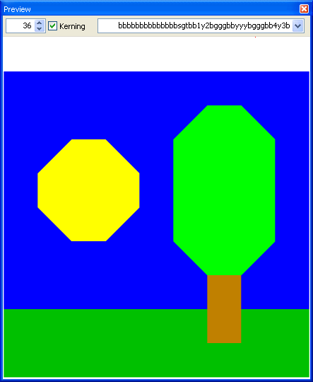
Here is an image for an experimental on-screen keyboard encoded in a font.
colour_keyboard_experiment.png
This experimental on-screen keyboard has only three characters, but this is a concept testing experiment. If this can be made to work, then such a keyboard could contain many characters from any encoded script or encoded symbol set.

The idea is that beneath the indicating glyph is a colour panel.

In the experiment, the colour of each indicating panel is a colour different from the colour of every other indicating panel in the glyph.

The Description text of the font would also include the following.

%original
{
ctc 0 255 0 → $0061
ctc 0 255 10 → $0062
ctc 0 255 20 → $0063
}

The ctc means colour to character.

In order that the capability to include more than one keyboard in a font, with overlapping use of colours, is available there is a facility that some colours can be global so as to change which colour to character table is being used. However, %original is the default colour to character table and does not need to be specifically selected at start up.

Apart from %original and %global, any name starting with % may be used as the name of a colour to character table.

I am thinking that it would be a good idea for the colours in a colour to character table never to be grey scale and for global colours always to be grey scale.

Examples of %global commands.

%global 10 10 10 → %Greek
%global 50 50 50 → %Cyrillic
%global 90 90 90 → %original

The %global 90 90 90 → %original in the above examples is so that one can get back to the original colour to character table.

It would need a special software application to make all of this work.

However, at the moment, one can download the image file and open the image in Microsoft Paint and use, for each colour indicating panel in turn, the colour picker then use the following.

Colors
Edit Colors…
Define Custom Colors >>

Also, at the moment, one can think about how such a facility could be useful.

William Overington

28 August 2013

The font exported from the project previewed in the previous three posts in this thread and also earlier in this thread is now published.

Copies are available free from the following thread.

http://forum.high-logic.com:9080/t/teleresearchcolourtest001-font/3947/1

William Overington

6 September 2013

colour_block_landscape001.png
The text entered into the preview text box was nine spaces followed by the following.

bbbbbbbbbb1y2bbbbbbyyybbbbbb4y3bbbbbbbbbbbbbbhhhhhhhhhhhhhhhhhhhhhhhhhhh

William Overington

26 September 2013

colour_block_landscape002.png
The text entered into the preview text box was nine spaces followed by the following.

bbbbbbbbbbbbbbsgtbb1y2bgggbbyyybgggbb4y3bgggbbbbbbvgubbbbbbbnbbhhhhhhnhhhhhhhhhhh

William Overington

27 September 2013

hmm.png
The text entered into the preview text box was eleven spaces followed by the following.

lllllkllllllllplllnlllllllllllllllclllllllrllllllllllllwlllllllllollllllllllllelllllllylllllllllllllllmlllgllllllllblllll

I altered the colour of the background on the palette dialogue panel to become the preset Light Green colour so that the white colour block would show against the background.

William Overington

27 September 2013

colour_block_landscape003.png
Please click on the image to display it in full.

The image was produced by using 16 spaces then the folowing 256 characters, at 18 point, though due to the way that the forum software works, the 256 characters are here split into four groups each of 64 characters, simply so as to be able to provide the information in this forum.

bbbbbbbbbbbbbbbbbbbbb5ww6bbbbbbbb5wwwwwwww6bsgtbbwwwwwwwwwwbgggb

b8wwwwwwww7bgggbbbbbbbbbbbbbgggbbbbbbbbbbbbbgggbbbbbbbsgtbbbgggb

bbbbbbgggbbbgggbbbbbbbgggbbbgggbbbbbbbgggbbbgggbbbbbbbvgubbbvgub

bbbbbbbnbbbbbnbbhhhhhhhnhhhhhnhhhhhhhhhhhhhhhnhhhhhhhhhhhhhhhhhh

William Overington

2 October 2013