Petite Capitals script

I am working with the Petite Capitals Private Use script and the thorn (Þ), the capital letter eng (Ŋ) and the capital ligature OE (Œ) were not being scaled down as they should be. I reasoned that since they were not being composed, they should be moved from the second group and placed into the first. That corrected the problem.

However, I cannot seem to find a way to position the accents, other than the dotbelowcomb, the commaaccent and the commaaboveright, properly with respect to the base glyphs. It seems that there must be a way to do this that I am missing here. Perhaps some tweaking of the CompositeData.xml would be the place to do it but, I am loath to touch that file.

Don’t be loath to edit the CompositeData.xml file if you need to. That’s why there is an option to “Copy Data Files to User Data Folder” in Tools, Options, Advanced.

The original file is saved in Program Files when FontCreator is installed:

You can always delete your copied version if you broke something, and copy the original again. If you copied it once before, it won’t be overwritten on using “Copy Data Files.” So, check the date of the copy in \AppData\Roaming\FontCreator\Composites. There is a newer version in the Tutorial thread that fixes a few bugs.

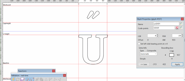
If there is a bug in the Petite Capitals script, edit it to move the insert Thorn character (58254) before the scaling operation. Here, the Capital Letter Eng and OE are being scaled correctly so I suspect that you may have an older version of the transform script. The CompositeData script does not do any scaling; it simply composes the PUA Small Capital or Petite Capital glyphs using the basic Latin glyphs. You can verify this by using Complete Composites on the Petite Capital glyphs after running the transform script.

The Petite Capitals Script.

  1. Inserts characters mapped to the PUA
  2. Completes Composites
  3. Decomposes (makes simple)
  4. Scales them down
  5. Makes them bolder
  6. Moves them back up to the baseline to compensate for vertical bolding
  7. Set the left side-bearing point to zero.

As the latter part of the script says:

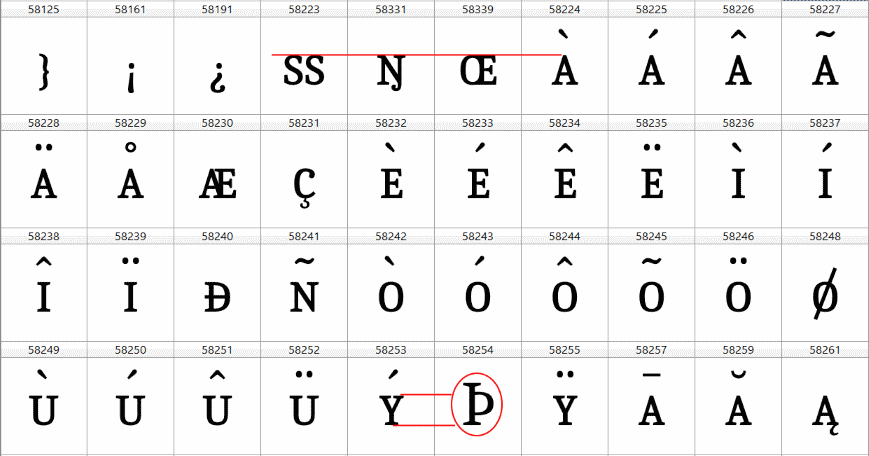
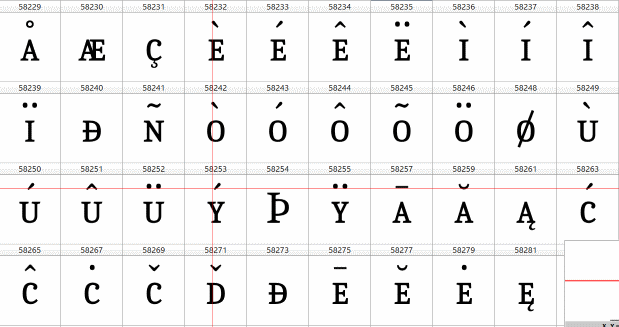
The rest of this script then adds composites of these new glyphs to create a wide range of accented small capitals and ligatures like AE. You will need to align the accents horizontally and edit some glyphs.

For the best results with Petite Capitals, you may need smaller accents than those used for the Latin-1 Supplement or Latin Extended character sets. Insert a set of low profile accents first, before running the Petite Capitals script, and edit the low profile accent glyphs to position them vertically to suit lowercase. They will then be correctly positioned vertically for Petite Capitals.

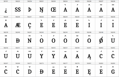
Petite Capitals are scaled to be approximately 65% the size of basic latin glyphs after bolding. The aim is to align with the x-height, which will, of course, vary from font to font, so the scale factor will probably need some adjustment.

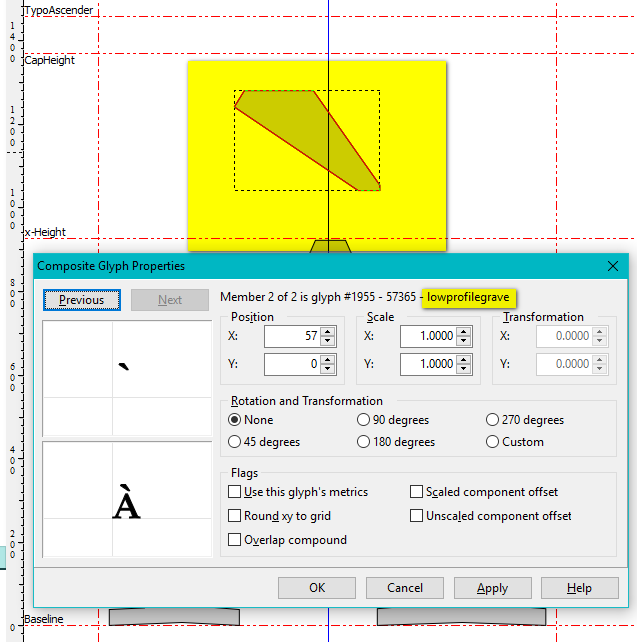
The accents are aligned by CompositeData.xml, but may need some manual adjustment. Acute and grave accents should be offset from centre alignment.

<Composite><!-- Small capital a grave -->
<GlyphMapping>58224</GlyphMapping> ; Petite or Small Capital A grave 
	<Member id="1">
	<GlyphMapping>58097</GlyphMapping> ; Petite or Small Capital A
		<UseMetrics>TRUE</UseMetrics>
	</Member>
	<Member id="2">
	<GlyphMapping>57365</GlyphMapping> ; lowprofilegraveaccent
		<GlyphMapping>96</GlyphMapping> ; grave (fallback glyph in absence of above)
		<Pos>Auto</Pos>
	</Member>
	</Composite>

Petite Capital A grave.png

Thanks for the coaching, Bhikkhu. I basically understand how the Petite Capitals in PUA script functions so I thought that I would write a script to create the low profile diacritics, as you suggested, in the PUA as well. Actually, I discovered that I already had a script named Low Profile Diacritics.xml, which you probably created, that looked like what I had in mind. Although I did not understand what the part was about it seemed harmless enough so I left it in. (perhaps I should have changed the 1024 to 2048 if it has anything to do with the funits per em but the widths seemed normal enough)

The accents were created in the PUA as expected and they were all very near the x-height line. However, they did not compose with the small caps as hoped … they were all floating above the Cap-height and even the bottom ones which fit perfectly previously were now too high when I ran the Petite Capitals Private Use script! I left them low before running the second script because, “Although they are only used with uppercase, they should be positioned vertically for lowercase. FontCreator will move them up for uppercase, the same as it does with regular accents.”

Failing to find any more concrete information in the manual, I tried one more ploy:
After creating the low-profile diacritics in the PUA, I moved all of the upper marks down well below the x-height level and I left the dot and comma below below the baseline where they belong. After running the Petite Capitals in the PUA script, I found that the top marks had move to a position above the x-height, not quite as unacceptably high as previously (yay!) but the lower marks had moved up for some unknown reason! Is there any reference material for the scripting language available? I saw that in another script, you were able to raise arrows to a specific height.

The best I could manage with the positioning of the accents was to move all of the high accents down by 440 after creating them with the Low Profile Diacritics script. This put them well below the x-height and when the Petite Capitals Private Use script was executed, these accents were moved up above the x-height line but still below the Cap-height. Leaving them as they were created by the Low Profile Diacritics always resulted in them being moved up above the Cap-height. As for the low accents, all of them were also moved upwards by the Petite Capitals Private Use script (why, I do not know) and each had a Y position value of 410 in the Composite Glyph Properties window and returning that value to zero put the accents back where they were after the Low Profile Diacritics ran.

Maybe the only way to correct this would be to alter the Auto line in the CompositeData script however, I suspect that this line is also responsible for raising the accents above the x-height when they are below it as well as being responsible for raising them above the Cap-height when they are below that level.

As my screenshot shows, the Y position of the lowprofile diacritics is zero.

Please attach your CompositeData.xml file and Petite Capitals Transform script from AppData. Zip them together with your font project if you’re willing to share that.

I have bundled the font project with the versions of CompositeData and Petite Capitals Private Use which I used. I also included a brief note on what transpired and noted the accent marks I added in order to get a complete run. Even the oriiginal scale factors have been left in the original file but I have also included my scale and bold factors in the note.

On the first run, the accents looked pretty good where they were succesful but that changed after I added the missing accents. You will also notice that the thorn @ 58254 has not been scaled down which is something I “corrected” in my Petite Capitals script but I did not touch it here … not wanting to add another layer of changes that might cloud the situation.

Thanks in advance for taking a look … I trust that you will quickly see what I do not.

PS I am unable to attach my zip file here . . . I’ll try through messaging.

Maybe this time it will work . . .
TestBed.7z (123 KB)

A few observations:

  1. The acute and grave accents are in the right position, but the other modifier accents from circumflex to hungarumlaut are below the x-height. The usual position is about half-way between the x-height and CapHeight metric lines.
  2. None of the accented glyphs are composites. If you use Complete Composites on Agrave to Aring, and agrave to aring you will immediately see the problem with the positioning of the modifier accents
  3. The scale factor for the Petite Capitals is too small for your font. The height of the H Petite Caps is 804 funits while the x-height of the font is 956 funits. There is no rule that says they must be the same height, but that is the usual design of Petite Capitals
  4. The Lowprofile Diacritics script will generate accents from the base modifier accents. If the base accents are too low, the low profile accents will be in the wrong vertical position too, even if the Petite Capitals are not smaller than usual. Manually scale the low profile accents to suit their intended use: whether that’s for Small Capitals, Petite Capitals, or for Regular Capitals. Compose the regular capitals before creating the low profile accents if you wish to use regular sized accents with the regular capitals.

Here is a quick edit of your font to show what I would do with it. I adjusted the scale factor for Petite Caps to 73 horizontal and 69.10 vertical.

Take a look, then adapt your scripts to suit whatever you need. After running the Petite Capital script you should manually adjust the serifs, which will be too heavy for the scaled down glyphs.

Open the Notes Panel (F2) to see what I did.
2K testbed fixed.fcp (151 KB)

Thanks for the super-fast response , Bhikkhu

Here are some super-fast comments on you notes before I digest the entirety of your comments:

  1. The low modifier accents were left over from an experiment which I mentioned earlier … at one time they actually wound up in the correct position just above the x-height after running the Petite Capitals script.

  2. The scale factors which resulted in the very small petite capitals were in the original PC script. The factors which I used were included in the notes. They produced a x-height exactly 70% of the cap height.

My intention was to provide the original font and scripts which I used to create my mess … I know that some of my “corrections” only added to the problems.

PS. As for the multiple zip file uploads; twice I got the message “File not uploaded” and saw no upload activity happening on my end. Yeah, easy! At other tries, I was told that I was attempting to “open” the zip file and asked if I wanted to save it or open it.

While I was working on this project and you mentioned the Low Profile Diacritics (LPD) script, I was under the impression that it was an optional procedure to be employed where there was not enough room for the accents … after running the Petite Capitals Private Use (PDPU) script, the accents were far from being crowded! Before the PCPU was run, the accents were pretty normal in the Latin -1 Supplement area. Note the expected contents of 222 & 223:
After PCPU script 02.png
After running the PCPU script, the accents on the lower case letters were slipping a bit and something was very wrong with 222 & 223:
After PCPU script 01.png
In the PUA the accents were way out of place. 58223, 58331 & 58339 were the expected small capitals however, 58254 was not reduced in size as it should have been.
Before PCPU script 01.png
So, obviously we have more than just accents gone wild here.
I decided to see what the LPD script would do and in addition to adding12 more diacritics, two of which seem to be duplicates, when I composed 192 thru 231 I got the same results as shown above after running the PCPU script. And again, all of the top accents in the PUA were pushed up over the cap height.
last dance.png
I really do not want anyone to “fix” this for me … I want to understand how it all ties together. I will look at your rendition tomorrow . . . I have had it for tonight :slight_smile:

I see that my images are too large, sorry, I reduce them by 60% next time :sunglasses:

The low profile accents are optional for uppercase accented glyphs to save space. These smaller accents are also better suited for use with Petite Capitals.

After running the PCPU script … something was very wrong with 222 & 223:

Running the PUA Petite Capitals script won’t have this result. This happens only if you wish to use complete composites on these characters as an aid to design if your font does not yet have contours for these glyphs. Decompose them, and use the knife tool and get union of contours to complete the glyphs.

In the PUA the accents were way out of place. 58223, 58331 & 58339 were the expected small capitals however, 58254 was not reduced in size as it should have been.

The lowprofile diacritics should be in the same vertical position as regular accents, but should be scaled down to be 80% or so smaller. They will be in the right position for x-height Petite Capitals.

I decided to see what the LPD script would do and in addition to adding12 more diacritics, two of which seem to be duplicates.

lowprofileinvertedbreve needs to be inverted after generation.

And again, all of the top accents in the PUA were pushed up over the cap height.

All accents are raised for capital letters by the difference between x-height and CapHeight.
In your font that is 1366 - 956 = 410 funits. That is why they must be positioned vertically for lowercase.

Horizontal alignment is automatic. Diaresis, Tilde, Macron, Breve, Circumflex, Dotaccent are all centred over the base glyph. Grave accent is offset to left of centre, and Acute accent is offset right of centre.

The lowercase a in your font has an optical centre that is not in the centre of the contour. In my fixed version, I added a contour with two nodes to adjust the physical centre to match the optical centre.
Adjusted Optical Centre.png
Physical Centre.png

Running the PUA Petite Capitals script won’t have this result. This happens only if you wish to use complete composites on these characters as an aid to design if your font does not yet have contours for these glyphs. Decompose them, and use the knife tool and get union of contours to complete the glyphs.

You are right, the PCPU script could not produce what I showed above in After PCPU script 01.png. It could only have happened if I had composed those characters. The contours for both of these characters do exist in the original font file. Granted, they do look exactly as they would if you had “composed” them from existing glyphs (and that may well have happened at some point in time) but, right now, they are simple contours that, like we humans, do not have a clue as to their origins. So, “complete composites” may be seen as a weapon of mass de-construction because it blindly overwrites prior creations.

Yes, your “fix” looks good and there are only a few items I might question but the main thing I am interested in now is why your accents came out where the are supposed to and when I run the PCPU script, they are all above the capital height. As you instructed, I had placed mine at exactly the same height you had yours. In fact, in one attempt I actually copied your accents into my project and they still went through the roof.

My umpteenth shot at getting this right . . .
Final Attempt40.png
On the Petite characters, the accents are above the cap height which means that they will have to be adjusted manually. The good news, I got the pesky SS Þ Ŋ & Œ petite capitals correct!

There is always undo if the result is not what you expect. New users should read the tutorial. Having spent hundreds of hours writing tutorials in my free time I am not very sympathetic to users who don’t even read the help topic on Complete Composites

  • The selected glyph(s) must be defined in the composite data file; either known by Unicode code-point or by glyph name.
  • If the selected glyph(s) are empty or simple they will be replaced wherever composites are defined. Do not include simple glyphs in your selection if you don’t wish to replace them with composites.
  • If the selected glyph(s) are already composites they will be replaced only if the composite glyph members are different, not if their positions or scale factors are different.
  • All composite members must be present in the font. If any composite members are mapped, but still empty, the composite glyph will be completed, though obviously missing the contours that have not been defined yet.


Yes, your “fix” looks good and there are only a few items I might question but the main thing I am interested in now is why your accents came out where the are supposed to and when I run the PCPU script, they are all above the capital height. As you instructed, I had placed mine at exactly the same height you had yours. In fact, in one attempt I actually copied your accents into my project and they still went through the roof.

Accents over lowercase and Petite Capitals are not moved vertically. If accents over capitals are moving up more than expected, check your x-height and CapsHeight in Font Properties, Metrics. As noted above the accents should move up by 410 funits. If you have changed the funits/em setting, the metrics may need to be recalculated.

Bhikkhu, as I am sure that everyone else here who has benefited from your ready sharing of your vast expertise in typography will agree, I really do appreciate the time and effort you have put into helping each of us learn this new craft. I also understand your frustration with those of us who might not quite “get it” when we read manuals or watch silent videos trying desperately to follow a tiny cursor flitting about the screen in a futile effort to unravel the mysteries of some new software. In the past, I too lost my patience with co-workers who constantly asked me what the Standard Specifications said on a particular matter (apparently, it was easier to ask than it was to read) or complained that my software programs did not function properly. However, it was often those very same “dummies” who could not follow directions who uncovered flaws in my software or revealed ambiguities in the Standard Specifications. So, bear in mind that we dummies are doing our part to make you even better.

I have read the manuals, looked at tutorials and the help topics all of my life but I am a hands-on sort of fellow and I have to “do it” in order to learn it. So, I’ll read about a certain function, what it does and how it does it, but it all remains Greek to me until I actually do it and see what was actually meant in the function’s description. Perhaps one of the most difficult dilemmas to resolve is to replace the expectations, which grew out your own understanding of the descriptions and instructions, with the actuality of the outcome. In other words, you must learn the true meanings of a new language and let go of all that you thought it meant.

Bhikkhu said:

Accents over lowercase and Petite Capitals are not moved vertically.

Perhaps a little ambiguity here. Prior to “complete composites” there are no “accents over lowercase”, they have yet to be placed. As I understand it, the “placement” is dictated by the accent’s own properties. In addition to size, shape and orientation, all of the accents have a defined x and y position in a space shared by every glyph. All of my accents are resting on a guide line @ y=1073 (117 funits above the x-height). None of the low profile accents, or any part of them, extend beyond the CapsHeight while some of the “normal” accents actually do.
LP accent40.png
After running the PCPU script, all of the low profile accents on the newly minted “small uppercase” glyphs have a y position value of (drum roll please) 410.
Small uppercase U40.png
One might correctly state that “Accents over lowercase and Petite Capitals have been moved vertically.”

PS In writing this, I think a relatively easy solution has occurred to me :bulb:

What you need to understand is that it is not my software. I objected to your comment about a weapon of mass de-construction, which was a direct result of not reading the online help. If you don’t wish to compose composites for existing simple glyphs do not select them.

Accents over lowercase are positioned horizontally; accents over Uppercase are positioned both horizontally and vertically.

The reasons why yours move up over Petite Capitals and mine do not is due to different versions of UnicodeData.txt

I reported this to Erwin to see if it’s a bug not to include the modified UnicodeData.txt in a standard installation. (Edit: I searched the Beta forum and found that it was intentional to include only the standard UnicodeData.txt file from Unicoode.org. This file is updated for each Unicode version update to add definitions for new glyphs, or include other changes).

As a permanent solution, I suggested deleting the AppData version of UnicodeData.txt if you have one and saving the version from the linked thread in AppData\FontCreator\Unicode. That UnicodeData.txt file defines Petite Capitals as lowercase. The modified Blocks.txt file simplifies the Insert Character dialogue if you don’t use CJK etc.

The easy solution that you alluded to is to temporarily edit CapsHeight to equal x-height before inserting the Petite Capitals with the Transform script. Then recalculate the metrics afterwards.

Later versions of FontCreator include Unmapped Transform scripts. Since they use no code-points, some problems like the above are avoided. However, the unmapped glyphs can only be used by applications that support the relevant OpenType features.

All of this information is documented already (mostly by me), but I admit that it is hard to find it. Over the years I have provided a lot of free support, but I use the software much less frequently now as I now have all the fonts that I need. I test each new version of FontCreator and update my own fonts when bugs are found.

Well, setting the cap-height to the x-height and setting the x-height 30% lower than original was not enough to get the petite caps accents positioned just above the original x-height when the PCPU script was run… they all went above the original cap-height. Are there other settings which need changing in order to get this trick to work?

I finally eliminated the “undefined” status of the Ẽ … and I think it was by adding both e’s to the glyphlist.dat which did the trick.

Looking at the Low Profile Diacritics.xml, it seems to me that 183 middledot, 184 cedilla, 789 comma aboveright and 806 commabelow should also be included since these also need to be scaled down for the petite glyphs.

I tried the files you pointed to here: http://forum.high-logic.com:9080/t/customising-unicode-data/1679/3
but it seems that they are not what you intended … they are dated 06/21/2017 and while they did alter the PUA listing, they did not seem to eliminate the small caps accent problem I will try them one more time.