Some font designs are harder to read than others. What is the word?
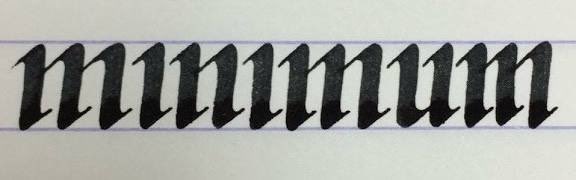
The word is “minimum”. While the gothic style is beautiful, it’s a bit of a legibility nightmare here. Pro tip: adding dots to the “i” would help distinguish the characters without ruining the aesthetic.
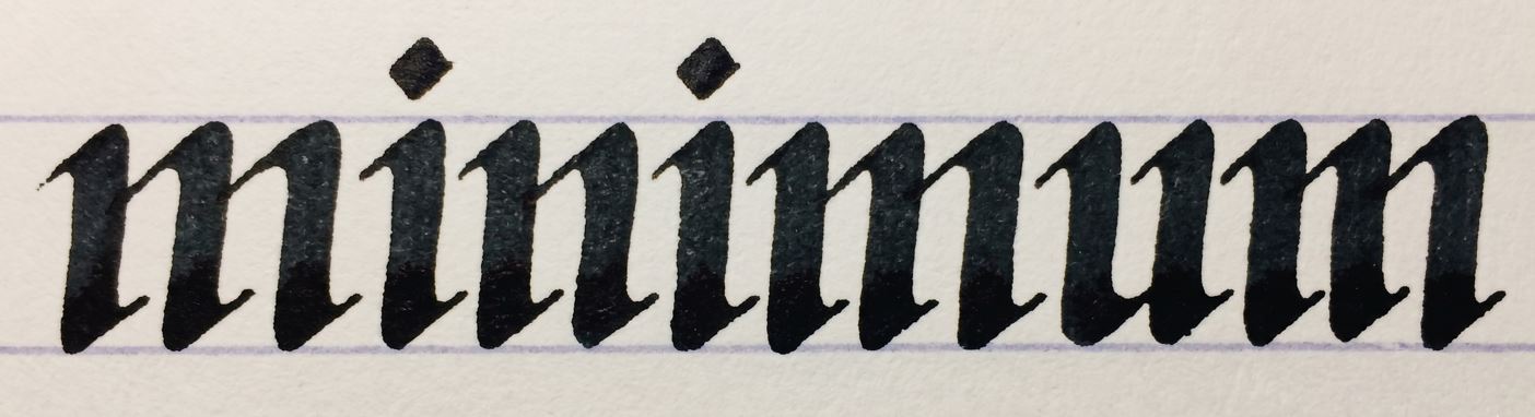
I tried simulating dots on the 'i’s just to see how it affects legibility. What do you think? Does this make it a bit clearer?