Hey there, folks! I took a break from type design for a while, but recently got back into it again, with the hopes of creating my very first handwriting-style (cursive) font, one based on that of my favourite author, Henry David Thoreau.
When I first dipped my toe in type design a couple decades ago, one of my first thoughts was how wonderful it would be to create a font from his handwriting, but as fans and scholars of his work are quite familiar with, Thoreau’s scrawl was notoriously illegible at times – and so I just never really pursued the idea, thinking that it would just be impossible, a futile effort.
But then a couple years ago I discovered his earlier essays from his college years, and they weren’t so bad at all! And so, starting with those as my basis, off I went to at least give it a shot – and much to my own great surprise, I think it’s turning out okay!
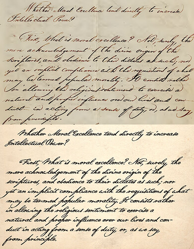
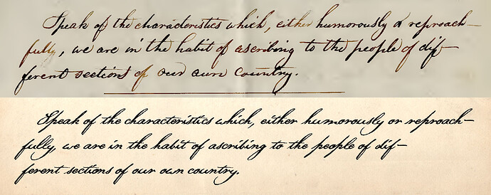
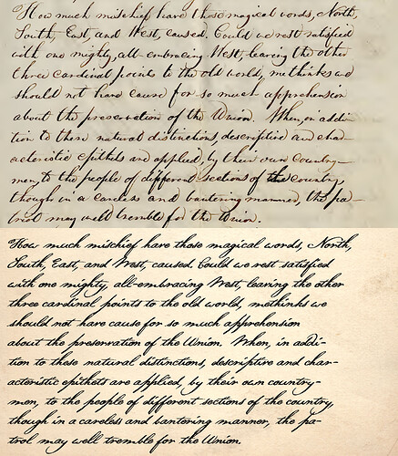
Here are three samples, each showing an excerpt written in Thoreau’s own original hand, along with a transcription done with my font. If I do say so myself, for my very first handwriting/cursive font (with letters connected and everything), I don’t think I did too badly, eh? ![]()
Here’s my questions, which brought me here today…
Firstly, as you can see in Thoreau’s original hand, his crossbar for the lowercase “t” is usually much, much more exaggerated than how mine ended up in the font. I shortened it up a bit (width-wise) because I was concerned that I might run into issues sometimes – but now I’m not sure if I would.
Is there any reason that I should not do so, should not just go ahead and make the crossbar longer, to better reflect Thoreau’s actual handwriting?
Also, I would just LOVE to be able to do those little swashy things he does whenever there’s an e, n or r (and perhaps other characters) at the end of a word – but I don’t know how.
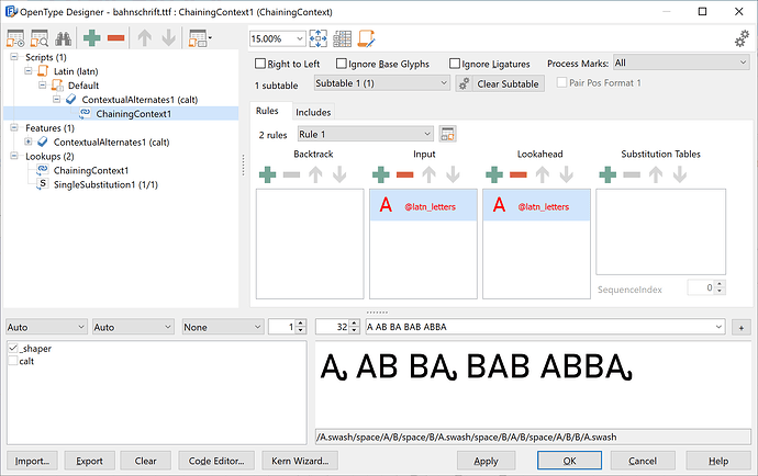
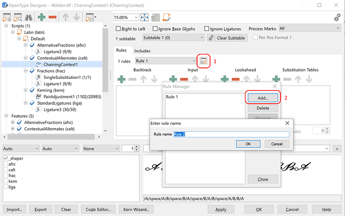
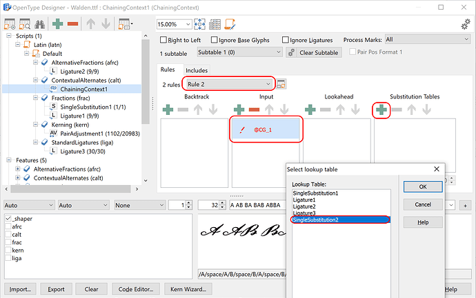
I know how to do ligatures, but how do you get a font to swap out a letter for another when it’s at the end of a word? I think that’s a “contextual alternate,” isn’t it? I can’t seem to find any sort of info or tutorial on how to go about creating those, though.
Please do correct me if I’m headed down the wrong path – but I am most certainly open to any suggestions that anyone might have to make my font “more like Thoreau” in any ways!
If you’d like to try it out yourself, I’ve created a web page where you can do so here (trying different sample texts, or typing in your own)…
And if you’d like to check out my font itself, you can find the always-latest version (which is updated regularly, as I’m working on it) here…
Much, much thanks and appreciation for any help and/or suggestions that anyone might have! ![]()
