Tip of the Day

As this thread is getting rather long, I have added a Table of Contents

The topic has been updated for FontCreator 13 by removing some tips that are now out of date.

  1. To Quickly Remove Guidelines
  2. Adjusting Geometric Centre
  3. Designing Ligatures
  4. Skewing Contours
  5. Making a Smooth Bracket
  6. Making Stencil Fonts
  7. Changing Straight Lines to Curves
  8. Copy/Paste to Create Composites
  9. Arranging Toolbars
  10. Renaming Tags
  11. Optical Metrics for Superscripts or Petite Capitals
  12. Tagging Composite Glyphs
  13. Exporting Web Fonts
  14. Editing Complex Glyphs
  15. Using A Background Image
  16. Sorting Files on Loading
  17. Restoring Windows and Toolbars
  18. Saving Font Validation Results
  19. Installing to a Custom Folder
  20. Checking for Errors
  21. Checking Kerning Pairs
  22. Using Shortcuts to Speed Workflow
  23. Scripts, Features, and Lookups
  24. Alternate and Winding Fill
  25. Trimming Kerning Pairs
  26. Adjusting the Accent Position
  27. Aligning Accents Using Guidelines
  28. Tagging Multiple Glyphs in Several Fonts
  29. Autokerning Large Fonts
  30. Finding Glyphs in Large Fonts
  31. Creating an All Caps Font
  32. Adding Programs to the Launch Externals Submenu
  33. Using the Preview Toolbar to Aid Kerning
  34. Using Access Keys
  35. Permalinks in Forum Update
  36. Overriding Automatic Glyph Naming
  37. Kerning of Scottish Names
  38. The Wonderful Windows Menu Key
  39. Comparing Font Styles in MainType
  40. Anchor-based Glyph Positioning and Auto-attach

To Quickly Remove Guidelines:

Double-click on the ruler and clear all, or select individual guidelines and click on delete.

Adjusting Geometric Centre

When FontCreator completes composites it aligns diacritics on the horizontal geometric centre of a glyph. The circumflex accent will be centred on the Capital E, for example. Acute accent is offset to the right so that its one third point is centred on the base glyph, while grave accent is offset to the left.

On some glyphs, like the capital E illustrated below, this looks off centre because the visual centre is a long way from the geometric centre.

Single Node Contour.png
To adjust the geometric centre of the capital E so that it aligns with its visual centre one can add a single node contour. (Single node, or two node contours won’t print. We can use them at the design stage and remove them later by using the font validation wizard). Insert a rectangle from the Drawing toolbar, select three nodes and delete them to leave a single node contour.

Move the single node contour until the geometric centre aligns with the visual centre. You can see where the geometric centre is from the middle handles when all contours are selected. Drag a vertical guideline to where you think the visual centre should be. This is best done with no bearing lines in view to distract you.

Now, when you use Complete Composites, the accents will be aligned optically rather than geometrically, and all other accents over or under the Capital E will be correctly aligned too, because the geometric centre has moved. One can also move the geometric centre of accents in exactly the same way by adding a single node contour.

Designing Ligatures

Select the ligatures in the glyph overview and press shortcut “P” to show them in the Preview Toolbar. Type a few letters to make words and repeat the whole words after the ligatures. Resize the Preview Toolbar so that pairs of words line up like this:

Now, you can easily see if the spacing and kerning are right, and if the design works aesthetically or not in a line of text.

Here is the same text with Pali Italic.

You can tell at once that I forgot to adjust the right side-bearings on the Qu ligature after moving the “u” to join the “Q,” and in the fi after moving the i to join the f.

The contour joining the st and ct is too heavy. It should be more like the contour joining the ck.

The sp ligature uses the “p” and “s” from the regular type style, not the italic typestyle :blush: Oh well! Back to the drawing board. :frowning:

After Making a Few Corrections

Skewing Contours

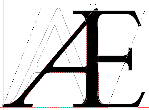
Sometimes you don’t know the precise angle to use in the Glyph Transform wizard, or the amount of skew to use on the Transform Toolbar. The easiest method is to use the skew handles. Select a contour or several contours with marquee or shift select, and click the selection again to get the skew and rotate handles when you mouse over the selection handles. Carefully grab the skew handle and skew the selection as you wish.

After skewing glyphs you will see some off-curve extreme points highlighted by the validation toolbar.

Making a Smooth Bracket

Delete any excess nodes at the bracket, leaving only three on-curve nodes, or add an on-curve node if needed. Drag the middle node of the three horizontally in line with the third node until the first node shows as red. The red nodes indicate that an on-curve node is redundant because it is in a straight line with another on-curve node.

Press the “F” shortcut to convert the middle node to an off-curve node.

Now the Validation Toolbar shows a different error — the off-curve node is an off-curve extreme. Click the “Add on-curve extremes” button on the validation toolbar to correct this problem.

The result is a smoothly curving bracket.

Making Stencil Fonts

Stage 1
Draw a rectangle, select all and centre align middle.

Stage 2

Stage 3
Drag select with the mouse to select the three offcuts, and press delete.

Stage 4
The end result.

Changing Straight Lines to Curves

In the latest version of FontCreator one can simply drag the centre of the line, but one will still have to fix off-curve extremes, so this method is still useful to know.

  • First add a node between the start and end of the line with the shortcut “a”
  • Convert this on-curve node to an off-curve node with the shortcut “f”
  • Select one or more nodes with marquee select (dragging with the mouse), or with the Lasso tool
  • Drag all of the selected nodes with the mouse to reshape the curve or curves together. Hold the shift key while dragging to restrain the movement to horizontal or vertical.
  • Use the keyboard cursor keys to move the nodes a precise distance: up/down/left/right to move by 10 funits. Hold down the Ctrl key to move by 1 funit, or the Shift key to move by 100 funits

Copy/Paste to Create Composites

If you have the Professional Edition, Complete Composites can be used to create many composites, for example to create subscripts from superscripts. However, if the glyphs are not mapped, for example, if you want to create denominators in the Private Use Area from superscripts, or if you’re using the Home Edition, then Complete Composites won’t be an option.

However, composite glyphs can be created by selecting the glyph members in the glyph overview, copying them to the clipboard, then pasting them into the empty glyph where you wish to create the composite glyph.

To speed up the process of creating all ten denominators from the ten superscripts, copy them all at once, paste them all into the target glyph, then delete those you don’t need.

Step One
Select all ten superscript glyphs in the glyph overview using Shift + Click, and Ctrl + Click. They will probably be in the order: 2,3,1,0,4,6,7,8,9 if the font is sorted in the standard order.

Step Two
Insert ten empty glyphs at the end of the font. Denominators intended for use with OpenType Features don’t need to be mapped. Or, you can map them to code-points in the Private Use Area.

Open the first empty glyph and paste the ten superscripts from the clipboard. You will see a confused mess of glyphs like this:
Pasted Composite Glyph Members.png
Step Three

To select the superscript zero cycle through the composite glyph members using the “w” shortcut key — the zero, which is the fourth on the clipboard will be selected with three presses of the shortcut key. Holding shift, press the down cursor about five times to separate the selected glyph from the group. If you get the wrong one at first, try again until the target glyph is separated from the group and in the right position on the baseline like this:
Target Glyph Member.png
Step Four

Use the shortcut key “Ctrl T” to invert the selection to get this:
Invert Selection.png
Press the delete key to delete the selected glyphs, and use the shortcut Alt Right cursor to move to the next glyph. Paste the clipboard contents again (Ctrl V), and repeat the process for the next denominator.

Using composites instead of simple glyphs reduces the size of the TrueType font file and makes the font easier to edit. If you later decide that the superscripts need to be bolder, for example, you only need to edit the superscripts, for the subscripts and denominators to be updated too.

Update: If a large numbers of glyphs are pasted, disable Automatic validation, and hide the Glyph Fills (shortcut Ctrl H in FontCreator 9.0.0.1916). Fill Outlines is a global setting that affects all Glyph Edit Windows.
Hide Fills.png

Cool! THANKS!

Arranging Toolbars

Maximise working space by arranging undocked toolbars over the otherwise unused FontCreator Window Title Bar to the right of the Help Menu.

Drag the toolbars to the position shown by grabbing the bottom of the toolbar’s title to undock any docked toolbar leaving its title bar just outside of the monitor. This is much easier to do without a font loaded, or with a category selected that contains only a few glyphs — then the Font Overview will not need to be redrawn when toolbars are moved.

On a 1920 x 1080 monitor, the Grid, Align, Glyph, and Overview toolbars will fit on one row with a few pixels to spare. Floating Toolbars like the Transform Toolbar can be moved up into any free space on the Tab Bar.
Rearranging Toolbars.png
After arranging the toolbars as you want them, right-click on any toolbar to lock the docked toolbars. The undocked toolbars will also be locked wherever you have positioned them, but they can redocked by double-clicking on their title bar.

Renaming Tags
Tags.png
The five tags used in the glyph overview panel can be renamed:

  1. From the Tools menu, open the Options dialogue
  2. On the Advanced tab, click on “Copy Data Files to User Data Folder”
  3. Then click on “Open User Data Folder”
  4. Open “tags.txt” in Notepad and edit each name to whatever you want, like the code shown below
  5. Save the file, and restart FontCreator to see the changes


;This file allows you to modify the names of the tag categories
;Type an Ampersand before the letter that you wish to use as an access key
;Restart FontCreator after modifying this file in order see the changes

[tags]
;Red
1=&To Do
;Orange
2=&Recently Added
;Green
3=&Done
;Fuchsia
4=&Colour
;Blue
5=Not in &WOFF

The Tags submenu will now look like this:
Tags Submenu.png
In FontCreator 64-bit, “tags.txt” is in the FontCreator installation folder in C:\Program Files\High-Logic FontCreator. You can still edit it, but you will need Admin permissions to modify it.

Optical Metrics for Superscripts, Petite Capitals

The Optical metrics feature is only available in the Professional Edition. This features calculates the optimal spacing for Basic Latin characters based on the character shape. If you add Small Capitals, Petite Capitals, or Superscript/Subscripts to your fonts, you might like to have FontCreator calculate the correct spacing for those glyphs too. Here’s how to do it.

  1. Copy the glyphs to a new font project and paste them into A-Z and/or a-z.
  2. Run Optical Metrics. For lowercase superscripts you might need to use a smaller value than the default of 27 — I used a space factor of 17. For the Petite Capitals I used a space factor of 21. Experiment until you’re happy with the result. The action can be undone.
  3. Copy and paste the optically spaced glyphs back to the original font

Superscript Optical Metrics.png
Petite Capitals Optical Metrics.png

Tagging Composite Glyphs

I sometimes want to recompose composite glyphs. Edit menu, Select Composites, Make Simple, Complete Composites is OK, but it is easy to lose the selection or one may want to exclude some composites from the process. Try this instead:

  1. Edit menu, Select Composites
  2. Tag them using one of the unused tags.
  3. Select the tagged glyphs using the Overview panel
  4. Work through the tagged glyphs, marking them as untagged when they have been fixed.

N.B. In FontCreator 10, the Tagging shortcuts (Ctrl+1 to Ctrl+5) now act as toggle keys.

Exporting Web Fonts

In FontCreator 12, this can be automated by using the new Include in Exports Feature
Include in Exports.png
Any glyphs that are marked (d) for Include in Export to Desktop (otf/ttf) will be excluded when exporting fonts for the Web (woff). I still need OpenType versions of the smaller fonts. This tip may still be useful to users of earlier versions of FontCreator.

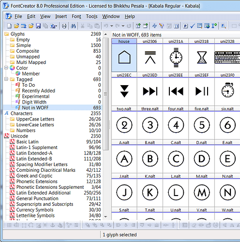
My fonts typically have about 2,000 to 3,000 glyphs, with many symbols and dingbats. While the size of the fonts is not a problem for desktop publishing applications, on the web it would be a significant issue. Even without hinting, my Kabala Regular WOFF font is 277 Kbytes (2,369 glyphs). By removing the Symbols, Arrows, Enclosed Alphanumerics, and Dingbats that can be reduced to 153 Kbytes — still a lot, but the glyph coverage includes Latin Extended A, Latin Extended Additional for Vietnamese, Basic Greek, etc., (1,495 glyphs). By removing the GPOS kerning tables, the file size is reduced to 86 Kbytes, which is much more reasonable for the web.

To make this easy:

  1. Tag all of the glyphs that are not required for the Web
  2. Select the tagged glyphs using the Overview side panel and delete them
  3. Export the font to Web Font (WOFF) format
  4. Undo the deletion, or just close the project without saving it

Web Font Test Page.
Not in WOFF.png

Editing Complex Glyphs

Note that FontCreator 10 can automate much of this work for you using the Optimize feature, which will reduce the number of nodes and remove off-curve extremes.

When editing complex glyphs with many contours, it sometimes helps to focus on one contour at a time to smooth curves and remove unwanted nodes. Using the mouse constantly leads to RSI so knowing how to get the most out of the keyboard shortcuts is helpful.

W and Q are the keyboard shortcuts for next and previous node in point mode, and next and previous contour in contour mode.

In points node, if nothing is currently selected, W will select the first node of the top contour in the stacking order (z-order), so to edit a contour it helps to bring it to the top of the stack first.

Stage One

In Contour Mode, select the contour that you wish to edit, zoom to selected (Shortcut Z), and bring it to the front using the icon on the Align Toolbar (you may have wondered what that was for, now you will learn how it can be used).
Bring to Front.png
Stage Two

Switch to Point Mode to start editing the contour. Press W to select the first node, then Q and W to cycle around the nodes, moving the nodes with the Cursor keys: up/down and left/right, holding the Ctrl modifier to nudge them by 1 funit, or the Shift modifier to move them by 100 funits. The delete key removes an unwanted node. Now nothing is selected, so press the W key again to select the first node and continue editing.

Stage Three

If the contour has a large number of nodes, or is big, and you need to zoom in to work, you will need to change the first point. Right-click on any node to change it to the first point.
First Point.png
Stage Four

Using the W and Q keys in Contour Mode will select the previous or next contour, then zoom to selected to focus on the next contour to work on, or zoom out (Z) to select one with the mouse.
Complex Glyph.png

Using A Background Image

I spend a lot of time smoothing glyphs to reduce the number of nodes. A nearly perfect circle can be created with just 12 nodes (create one with the ellipse tool to see), so only two off curve nodes are needed between two on-curve nodes for a smooth quadrant. After applying an italic transformation, and removing off-curve extremes with the validator, you will see many intermediate nodes that are not really necessary. Use the background image to take a snapshot of the current glyph’s shape before you start removing nodes.

  1. Show the Background Image Toolbar (F9)
  2. Copy from current glyph
  3. Select a vivid colour like yellow for the colour
  4. Hide the Fill of outlines.

Now, after deleting all but the two off-curve nodes nearest to the on-curve nodes of a quadrant, you can simply move these two nodes until the curve fits the background image. Here’s a screen shot from an italic figure eight. The background image toolbar can be hidden once you have copied the current glyph.
Background Image.png

Sorting Files on Loading

Here’s a simple trick. I like to have all four fonts in a family arranged in a logical order Left to Right: Regular, Italic, Bold, Bold Italic.

When opening projects, in the File Open dialogue, click on the Name heading twice to sort them in reverse order, like this.
Sort by Name Reverse.png
Now select the four files and click on Open. They will open in this order on the Tab bar.
Sort by Name.png
See this earlier tip on how to rearrange the tabs by closing and reopening FontCreator.

Restoring Windows and Toolbars

After carefully arranging the toolbars where you want them, export the FontCreator Windows Registry key to keep a backup of the settings. The exact path will depend on the version. For FontCreator 12 it will be found here:

[HKEY_CURRENT_USER\Software\High-Logic\FontCreator\12.0\Position\Toolbars]

Keep a backup of your registry keys on external media too. If you need to reinstall FontCreator, run the registry file from Windows Explorer to add the settings back to the Windows registry.

The latest versions of FontCreator makes this tip obsolete as validation errors are now shown in the Trouble-shooting category of the Overview Panel, but the tip is still useful for those with older versions.
Validation Issues.png
Saving Font Validation Results

A few users have requested that the Font Validation results window be made non-modal so that it can be referred to while correcting errors, but for the reasons stated in this post it is not practical to do that.

Here is a work-around for the problem:-

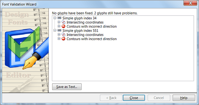
  1. After running the validation wizard, click on the “Save as Text …” button. It doesn’t matter much where you save it, as we’re going to delete it very soon.
  2. Click on the button to save it again, which will open the file save dialogue in the same folder
  3. Select the previously saved file, right-click, and Edit it in Notepad (or whatever is your default text editor)
  4. Select all of the text, and copy it to the clipboard (Ctrl C)
  5. Close your text editor (Alt F4)
  6. Delete the previously saved file (press Delete)
  7. Cancel the save text file dialogue (Escape)
  8. Close the Font Validation Wizard (Escape)
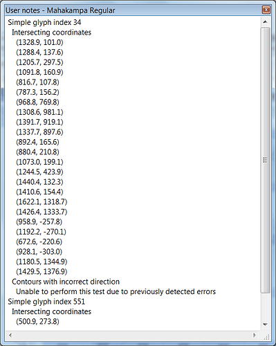
  9. Open the User Notes Toolbar (Shortcut F2).
  10. Paste the clipboard contents (Ctrl V)
  11. Save your FontCreator project file (Ctrl S).

It may seem like a lot of steps, but it does not take long to do. You can now correct even a long list of validation errors that FontCreator was unable to fix automatically (usually Intersecting co-ordinates), deleting each error readout from the User Notes toolbar as you go.
Font Validation Report.png
User Notes.png